


 hello@kootenaymade.ca
 Castlegar, BC. Serving the Kootenays and beyond.
 8 min read
Key takeaways
- Google crawls with a smartphone agent, so the phone version of your page is the version being judged.
- The same six failures cause almost every bad phone experience on a small-business site.
- The ten-minute test needs your own phone on cell data and one person who does not work for you.
- Google asks whether content displays well on mobile and whether pages avoid intrusive interstitials.
- The theme is the problem when fixing the phone breaks the desktop.

On this page
What does mobile-friendly actually mean now?
It means one site that reshapes itself to the screen, with text readable without zooming, controls a thumb can hit, and the same content the desktop has. Google recommends responsive design for exactly this and crawls with a smartphone agent. This guide is for an owner whose site already exists and looks wrong on a phone; if nothing is built yet, this is the order to build it in.
Around here the phone is not the second screen. Somebody parked outside a shop on Baker Street in Nelson is deciding whether to walk in. Somebody driving Highway 3 toward Creston is deciding where to stop for lunch. Neither of them is going to get to a laptop first.
The stakes are higher for food than most owners think. As of September 3, 2026, The Kootenay List counts 447 businesses in its restaurants category across the region, and 212 of them have no website at all. Being the one place whose hours and menu load properly on a phone is a real advantage in a town of that size.
What are the six failures people actually see?
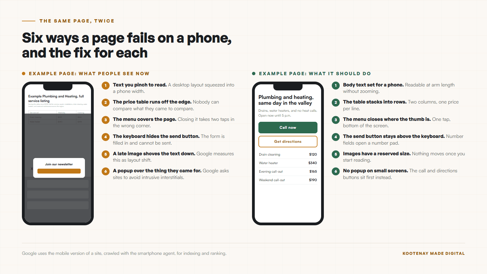
Almost every bad phone experience on a small-business site is one of six things. None of them is exotic, and five can be fixed inside the site you already have. Read the list with your own site open beside you.
- 01
Text you have to pinch to read
A desktop layout squeezed into a phone width. The body copy lands somewhere around nine pixels and everybody zooms, which throws away half the page off the sides.
- 02
Tables and price lists cut off
A pricing table built for a wide screen either runs off the edge or shrinks until the numbers are unreadable. Menus and service lists fail this way constantly.
- 03
A menu that overlaps the page
The header sticks, the hamburger opens over the content, and closing it takes two taps in a spot your thumb cannot reach. People leave rather than fight it.
- 04
Forms that argue with the keyboard
The keyboard opens, the field scrolls out of view, and the send button hides behind it. Phone number fields that show a letter keyboard belong here too.
- 05
Images that arrive late and shove everything down
You start reading, an image finishes loading, and the paragraph jumps. Google measures exactly this as layout shift and puts the good line at 0.1.
- 06
A popup covering the thing they came for
Google lists avoiding intrusive interstitials as one of its page experience questions. On a phone a newsletter box covers the whole screen, and the close button is often the smallest thing on it.
The tap-to-call one deserves its own sentence, because it costs the least and is missed the most. A phone number typed as plain text is a phone number nobody dials. Making it a link takes minutes and is the highest-return change on this whole page. The same argument, at more length, is in why your contact page feels like a dead end.
How do I test this in ten minutes?
Your own phone, on cell data, without zooming, and one person who does not work for you. That is the whole rig. Tools tell you what is technically wrong; a person tells you where they gave up, which is the more useful of the two.
- 01Open your homepage on your own phone, on cell data, not the shop wifi. Do not zoom. Read the first screen as it is.
- 02Find your phone number and tap it. It should dial. If it does not, that is a five-minute fix worth doing today.
- 03Find your hours. Count the taps. Two is fine, four means people are calling you to ask instead.
- 04Open your services or menu page and try to read a price. Turn the phone sideways only if you had to.
- 05Fill in your own contact form, all the way to sending. Watch what the keyboard covers.
- 06Load the page you would send a customer, and count out loud until you can read the headline.
- 07Hand the phone to somebody who does not work for you and ask them to book, order, or call. Say nothing while they try.
The last step is the one owners skip and the one that finds the real problem. You know where everything is. A stranger does not, and their hesitation is the exact place your site is failing. It is the same test I describe in why small business homepages confuse people.
Watch a stranger use it on a phone and say nothing. The silence tells you where it breaks.
What does Google actually judge on a phone?
Four things, all documented, none of them mysterious. The headline fact is that Google indexes and ranks using the mobile version of your pages, so a site that is fine on a desktop and broken on a phone is a broken site as far as search is concerned.
- It crawls with a phone
- Google says it uses the mobile version of a site, crawled with the smartphone agent, for indexing and ranking. The phone version of your page is the version being judged.
- It expects the same content
- Google asks that the mobile site contain the same content as the desktop site, and warns that differences affect ranking for the same keywords.
- It prefers responsive design
- Google recommends responsive web design as the easiest pattern to implement and maintain, rather than a separate mobile site.
- It asks six page experience questions
- Core Web Vitals, secure serving, whether content displays well on mobile, excessive ads, intrusive interstitials, and whether the main content is easy to pick out.
Speed sits underneath all of it. Phones are slower, cell data is slower, and the fifth failure on the list above is measured directly as layout shift. If your phone experience is mostly a waiting experience, start with why your website is slow and what to do about it instead.
When is the theme the actual problem?
The theme is the problem when the fix is blocked rather than unknown. You can see what is wrong, you know what it should do, and the platform will not let you get there without custom code. Five signs make that clear.
- Fixing one thing on the phone breaks the same thing on the desktop.
- The layout options stop where the problem starts, and the answer in the help forum is custom code.
- Every page inherits the same broken header, so there are twenty copies of one bug.
- The theme was bought for a look, and the mobile version was an afterthought by whoever built it.
- You are paying a monthly platform fee and still cannot change the thing that is wrong.
There is a fair version of this and an unfair one. A theme that needs an afternoon of settings work is fine. A theme where every fix requires a developer, on top of a monthly platform fee, is a ceiling you are paying to stand under. The math on that is in a refresh against a full rebuild.
What does each fix actually cost?
Most of this is hours rather than projects. The table below is the order I work in, cheapest and highest-return first. Nothing here needs a rebuild unless the theme blocks it.
| What is being compared | Roughly what it takes | Who it affects |
|---|---|---|
| Tap-to-call and tap-for-directions | Minutes. A link change. | Every phone visitor. |
| Body text too small | An hour, if the theme lets you set it. | Everyone who has to pinch. |
| Tables and menus running off the edge | An hour per page to make them scroll or stack. | Anyone comparing prices. |
| Forms fighting the keyboard | An afternoon, including field types and button placement. | Every lead you nearly got. |
| Images shifting the layout | An afternoon to set sizes and compress. | Anyone reading the first paragraph. |
| Popups on small screens | Minutes to turn off. Longer to argue about. | Everyone, twice, if it reopens. |
Booking and ordering flows are where the money leaks fastest, because a phone visitor who abandons a form is a job you never hear about. What booking friction costs a local service business walks through that specific leak with the fixes.
When is it time to call someone?
Call when the list above is done and the phone experience is still wrong, or when the platform blocks the fix. Also call when the broken pages are the ones that earn you work, because those hours are worth more than the repair bill.
On a build, I lay the phone version out first, then let the desktop inherit from it, which is why the failures on this page rarely appear in that direction. Retail and food sites get the extra pass, because a menu and a price list are the two things people read standing up. If you want a second opinion on yours, run the free check-up and I will go through it on a real phone and tell you which of the six you have. Once it is fixed, keeping it that way is what website maintenance from the person who built it is for.
Design it for the parking lot first. The desk version takes care of itself.
Sources and further reading
- Google Search Central: mobile-first indexing
Checked September 5, 2026. Google uses the mobile version of a site, crawled with the smartphone agent, for indexing and ranking, expects content parity across versions, and recommends responsive design.
- Google Search Central: page experience
Checked September 5, 2026. Lists the six self-assessment questions, including whether content displays well on mobile devices and whether pages avoid intrusive interstitials.
- Google Search Central: Core Web Vitals
Checked September 5, 2026. Documents the layout shift threshold of 0.1 and the 2.5 second largest-paint threshold that a phone visitor feels most.
Frequently asked questions
What does mobile-friendly actually mean now?
It means one site that reshapes itself for the screen it is on, with text you can read without zooming, controls your thumb can hit, and the same content the desktop version has. Google recommends responsive design for exactly this reason and crawls with a smartphone agent, so the phone version is the one being judged.
How do I test my site on a phone properly?
Use your own phone on cell data, away from your wifi, and do not zoom. Then hand it to somebody who does not work for you and ask them to do the thing customers do: call, book, or find a price. Watch without helping. Ten minutes of that finds more than any tool.
Is a separate mobile site a good idea?
Rarely for a small business. Google recommends responsive design as the easiest pattern to build and maintain, and a separate mobile site doubles the number of pages you have to keep matching. Two versions drift apart, and Google warns that content differences between them affect ranking.
Can I fix this without rebuilding the whole site?
Often, yes. Tap-to-call links, text size, scrolling tables, form field types, image dimensions, and turning off phone popups are all changes inside an existing site. The rebuild conversation starts when the theme itself blocks the fix, or when fixing the phone breaks the desktop.
How much of my traffic is really on a phone?
Check rather than guess. Your analytics will show the split for your own business, and for most local service and food businesses phones are the clear majority. The number that matters is yours, on your busiest page, this month.
Related pages
Kootenay Made Digital
I build websites, local presence, and calm AI setups for Kootenay small businesses. Plain language, published prices, and clear work that makes you easier to find and easier to choose.