Key takeaways
- A contact page is not a utility screen. It is the moment warm intent becomes action or quiet delay.
- Give people the right path: form, phone, booking, quote, or directions, depending on the business.
- Response times, short forms, service area, trust proof, and mobile tap targets convert more than a fancy heading.
- Kootenay businesses need town, rural route, and seasonal clarity because distance and timing change the decision.
- Fix the path before you redesign: map the options, cut friction, track the actions, make follow-up operational.
On this page
What should a contact page actually include?
A strong contact page needs a short human intro, a primary and a backup contact option, a simple form, a clear response time, service area or location details, one piece of trust proof, privacy reassurance, and an obvious next step after someone submits, calls, or books.
A visitor who reaches the contact page has already done more work than a casual browser. They found the site, scanned enough to care, and decided the next step might be worth taking. The page just has to make that step easy and certain. Most do the opposite: a blank form, a vague promise, no phone path, and no clue who you serve.
If the page does not explain how to reach you, when you reply, and what happens next, the visitor has to invent the missing story. People rarely invent the version that benefits the business.
Why do contact pages leak leads even when people are interested?
Contact pages leak because they are built like administrative leftovers. The homepage gets positioning, the services page gets proof, and the contact page gets whatever form was easiest to install. That is backwards. It is the final bridge between interest and a real conversation, and small uncertainties stacked together make a busy person delay.
The bridge has to answer practical questions fast. Can I call? Can I book? Do they serve my town? How long until they reply? What should I include? Is this safe to send? When the page cannot answer those, interested visitors are being asked to gamble, and later usually means never, especially when they are comparing three contractors in Castlegar or trying to book a clinic in Nelson.
- The only path is one blank form with a vague "we will be in touch" and no reply window.
- Mobile visitors cannot tap to call, book, or get directions without pinching and hunting.
- The form asks for more than the first reply actually needs, so people abandon it.
- Nothing says which towns you serve, so rural and out-of-area visitors guess and leave.
- There is no proof near the form: no review, photo, credential, or local trust cue.
- Submissions land in an inbox with no owner, no template, and no follow-up window.
Which contact paths should a local business offer?
Offer the paths that match how people actually reach you, not every possible widget. Most local businesses need two or three: a short form for written details, tap-to-call for urgent or mobile visitors, and a booking, quote, or visit path depending on whether time, scope, or directions is the real conversion step.
- 01
Primary form
Best for project details, intake questions, custom quotes, or anything that needs written context before a reply.
- 02
Tap-to-call
Best for urgent trades, restaurants, same-day availability, and travellers comparing options from a phone.
- 03
Booking path
Best for clinics, salons, tours, tables, rooms, and services where available time is the real conversion step.
- 04
Quote path
Best for contractors and custom work, where town, scope, timeline, and photos change the fit and the price.
- 05
Visit path
Best for shops, restaurants, and rural locations where directions, parking, and hours prevent hesitation.
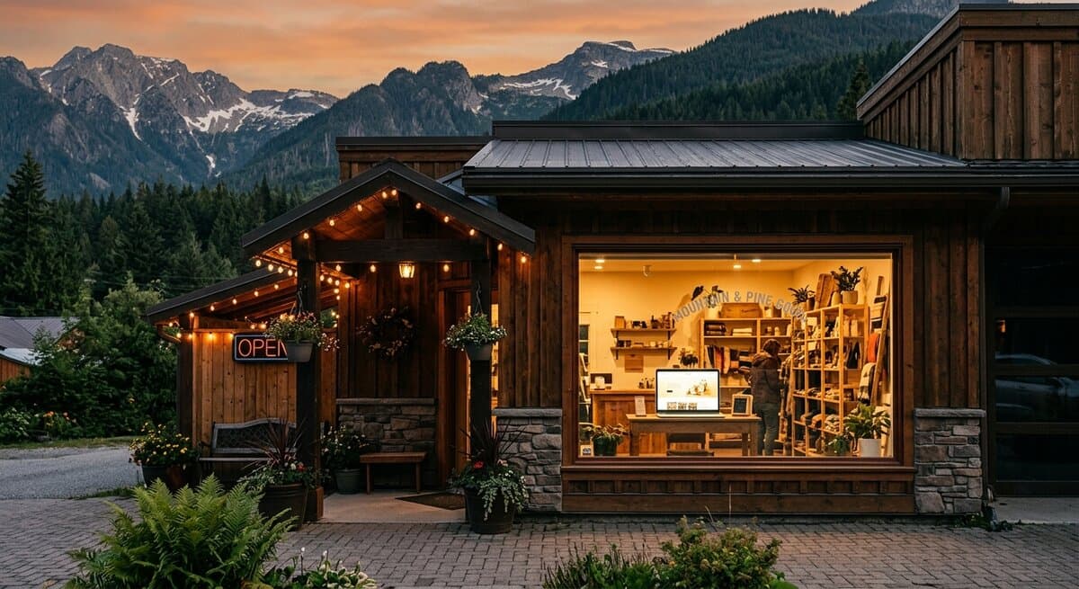
A Trail contractor needs a quote path and a phone path. A Nelson clinic needs booking, a privacy-aware form, and parking details. A Rossland restaurant needs hours, reservations, and a menu. The job is to decide which paths matter, place them clearly, and remove the small doubts that make people hesitate. A wedding or event venue needs a date-check and a tour request more than a generic form, which is exactly what a wedding or event venue website should get right in its inquiry path.
Long contact form vs short contact form: which converts better?
A short form converts better in almost every local-business case. It asks only what the first reply needs, so more people finish it. A long form feels like applying for a mortgage and quietly loses the busy people you most want. Add a field only when it changes how you route or price the inquiry.
| Long form | Short form | |
|---|---|---|
| Fields | Eight or more, many required | Three to five, only what the first reply needs |
| Felt effort | High, feels like an application | Low, finished in under a minute |
| Mobile completion | Drops sharply on a phone | Holds up on a phone |
| Lead quality | Fewer leads, not always better | More leads, routed with one smart question |
| Best use | Detailed intake the business truly needs | Most local contact, quote, and booking starts |
| Risk | Abandoned forms that look like no interest | Slightly less context, easily asked in the reply |
If you genuinely need detail, ask one targeted routing question, like service type, town, or preferred date, and explain why you are asking. Everything else can be gathered in the first reply once the conversation is open.
What kills friction on a contact page?
The dead-end feeling comes from small uncertainties stacked together: a vague button, no response time, too many fields, a mobile thumb trap, and no proof. Fix those five and the page stops feeling like a service counter with the lights off. None of it requires a redesign.
- 01
Replace the vague button
Swap generic "contact us" copy for the real action: call for availability, request a quote, book an appointment, or get directions.
- 02
Add a real response promise
State same business day, within one business day, or that peak-season replies can take two days. Silence makes people assume the worst.
- 03
Cut required-field bloat
Keep name, contact method, reason, and message. Ask one routing question only when it changes the reply, and say why.
- 04
Fix the mobile thumb trap
Use large tap targets, separate links from each other, keep call and booking visible, and test on a real phone, not a desktop preview.
- 05
Put proof beside the form
Place one strong review, project photo, credential, or local client note next to the form so it does not feel like a blank utility page.
Local specificity is not decoration here. A business might serve Castlegar but not every road outside it. A contractor might cover Nelson and Trail but take Rossland work only in certain windows. Surfacing those details before someone asks saves staff time and signals that you understand the local reality instead of hiding behind a template. For the bigger picture, pair this with my guide on looking trustworthy online in 10 seconds, because the contact page cannot carry the entire trust burden alone.
What does a good contact page look like by business type?
A good contact page changes shape by business type, town, season, and urgency. The pattern is the same, a clear primary action with a backup, but the right action differs. Here is what to lead with for common Kootenay business types.
- Contractors and trades
- Lead with tap-to-call and a quote path. Name service towns, minimum job size, seasonal lead time, and emergency versus scheduled work.
- Clinics and wellness
- Lead with booking, with phone backup. Note intake expectations, parking, accessibility, and cancellation. Do not invite sensitive health details through an open form.
- Restaurants and cafes
- Lead with current hours, reservations, phone, and directions. Add patio or seasonal notes and fast mobile actions for people already nearby.
- Local shops and brands
- Lead with hours, directions, pickup, shipping, and custom or wholesale orders. Separate visit questions from online order questions.
- Tourism and seasonal operators
- Lead with availability, booking, weather or smoke updates, drive time, and an obvious phone path for travellers in motion.
- Professional services
- Lead with fit, scope, a consultation path, response window, and privacy reassurance. Say whether the first conversation is free.
Seasonal reality matters across all of them. Summer demand, ski season, wildfire smoke, and winter roads change response times, hours, and availability fast. Saying so up front is part of the contact page, not a separate apology later. If your service pages also need work, my guide on what each KMD build includes shows where contact, booking, and quote paths fit into a larger site.
What should you track to know if the contact page works?
Track the whole path, not just completed forms. Phone taps, email taps, form starts, form errors, booking clicks, quote clicks, and direction clicks all tell you something. So do the staff notes after follow-up: wrong town, no budget fit, urgent, booked, or lost. Raw submissions alone hide abandoned forms and bad-fit leads.
- Phone and email taps
- Track mobile call and email clicks so you know whether phone-first visitors are actually acting.
- Form starts and errors
- Track when people begin the form and where errors block them, so required fields are not quietly killing completion.
- Form submissions
- Track the confirmed send state, not just button clicks, so failed validation does not look like a lead.
- Booking and quote clicks
- Track clicks to booking tools, calendars, quote forms, and any third-party reservation system.
- Directions and map clicks
- Track directions for shops, clinics, restaurants, and rural locations where the visit path matters.
- Lead quality notes
- Tag town, service type, fit, booked value, and lost reason so the page improves from real inquiry patterns.
The point is not to turn a small business into a dashboard cult. It is to know where interest turns into action, where it gets stuck, and which questions keep showing up because the page failed to answer them. Then the quiet operational win is making sure every inquiry has an owner, a reply window, and a first-response template, so the page does not create leads the business is not ready to catch.
How do I fix a contact page that loses leads?
Fix the path before you redesign the page. In one focused afternoon you can repair the contact machine: clarify the action, set the response time, ease the mobile path, prove the business is real, and explain what happens next. Once that works, polish the layout.
- 1Open the page on a real phone and tap every action. Try the form with one required field missing.
- 2Rewrite the intro and primary button so people know what to do, who you are for, and which path is fastest.
- 3Add a realistic response promise, including seasonal or after-hours limits.
- 4Cut form fields, add visible labels and clear error copy, and write a confirmation that explains the next step.
- 5Name the towns and travel limits you serve, and add one proof block near the form.
Redesigning before fixing the path is expensive theatre. Do the five steps first, send a test inquiry to confirm the follow-up actually works, and the page stops being the end of the trail. It becomes the bridge. If you want a second set of eyes on the full inquiry path, run the free website scan and I will show where people gain confidence, where they lose it, and whether the contact page is helping or stalling the decision.
Sources and further reading
- Google Search Central: page experience
A contact page that is hard to read, tap, or complete works against the helpful, mobile-friendly, secure experience Google rewards.
- Google Business Profile help
Phone, address, hours, and service area on your contact page should match your Business Profile so visitors never see conflicting facts.
- WCAG 2.2 quick reference
Directly relevant to contact forms: visible labels, readable contrast, error identification, keyboard access, and adequate tap targets.
- Nielsen Norman Group: form design
Research-backed guidance on short forms, clear labels, and reducing friction, the exact problems that make contact pages feel like dead ends.
Frequently asked questions
What should a contact page actually include?
A short human intro, a primary and a backup contact option, a simple form, a clear response time, service area or location details, one piece of trust proof, privacy reassurance, and a clear next step after someone submits, calls, or books.
How many fields should a local business contact form have?
Use the fewest fields that make the first reply useful. Most businesses can start with name, email or phone, reason for reaching out, and a short message. Add one routing question, like town or service type, only when it changes the next step.
Should I show my phone number or force everyone through the form?
Show the number when calls help the business. Contractors, clinics, restaurants, and tourism operators often need tap-to-call because mobile visitors may be urgent or travelling. The form can still be the main path when written details matter.
What response time should I promise on a contact page?
Promise the time you can reliably honour. Same day, one business day, two business days, or call for urgent needs are all fine when they are clear. Silence is the real problem, because visitors assume the worst and move on.
How should rural or seasonal Kootenay businesses handle contact pages?
State the towns, travel radius, seasonal availability, and weather or road constraints up front. A Nelson tour operator, Rossland contractor, or Cranbrook clinic should not make people guess whether distance, season, or staffing changes the next step.
What privacy reassurance should a contact page include?
Tell people what the form is for, who receives it, and that their details are used only to reply. Clinics, legal, financial, and wellness providers should be careful and avoid inviting sensitive health, legal, or payment details through a generic form.
What should I track to know if my contact page works?
Track phone taps, email taps, form starts, form errors, completed submissions, booking clicks, quote clicks, and direction clicks. Then tag lead quality after follow-up. Raw submissions alone hide abandoned forms and bad-fit leads.
What should I fix first if I only have one afternoon?
Fix the first screen, the tap-to-call or booking path, the response promise, and the form length. Add visible labels, a service-area note, one proof block, a privacy line, and a real confirmation message. That is the triage before any full redesign.
Kootenay Made Digital
We build websites, local presence, and calm AI setups for Kootenay small businesses. No jargon, no agency fog, no surprise fees.