Key takeaways
- A service page is a decision path for one service, one buyer situation, and one clear next step.
- More calls are not automatically better. Qualify service area, scope, timing, and price before the phone rings.
- Proof has to match the service: photos, reviews, project examples, credentials, and local context people can believe.
- FAQs are conversion tools. They cut hesitation, prevent bad-fit calls, and give Google clearer service context.
- If the page is live, fix clarity, the contact path, and proof first. Redesign last.
On this page
What is a service page actually for?
A service page does three jobs at once: it helps a visitor understand the offer, helps Google understand the topic, and helps you filter inquiries. It should explain what the service solves, who it is for, what it costs or depends on, when it can happen, why you are credible, and how to take the next step.
Google's SEO Starter Guide points owners toward clear, useful pages that people and search engines can both understand. The local version is brutally practical: say what you do, where you do it, who it helps, what proof exists, and what someone should do next. If one of those jobs is missing, the page leaks.
A useful page makes a good-fit buyer more confident and lets a bad-fit buyer self-select out before wasting anyone's afternoon. That is the whole game.
A service listing names the thing. A service page earns the inquiry.
Signs your service page is leaking calls or attracting bad leads
Your page is leaking when it explains the service but never qualifies the buyer, or when it qualifies nobody and the phone rings with wrong-town, wrong-budget, wrong-scope inquiries. Run the checks below. If several are false, the page is the problem, not the traffic, the ads, or the algorithm.
- A stranger can name the exact service in the first five seconds.
- The page says who the service is for and who should choose a different path.
- Service areas, travel limits, town coverage, and seasonal availability are stated plainly.
- Pricing context is visible, even if every job still needs a custom quote.
- Timing is clear: booking lead time, response time, and what happens after an inquiry.
- Photos, reviews, projects, and credentials are specific to this service, not generic stock.
- Someone can call, book, or request a quote from a phone without hunting.
- FAQs answer the questions that usually waste phone time or block a decision.
- Internal links point to related services, process, audit, and proof pages.
- Lead quality is measured, not just the raw number of calls.
Most weak pages are not weak because the business is bad. They are weak because the page refuses to be specific. It says quality service, trusted local team, or customized solutions, then never tells the visitor what happens if they call.
Service listing vs. service page: what is the difference?
A service listing names a service and links to a contact form. A service page is a full decision path: it qualifies the buyer, shows proof, sets pricing and timing expectations, and matches the next step to the moment. The difference is not page length. It is whether the page does the work of earning a good-fit call.
| Service listing | Service page that converts | |
|---|---|---|
| Primary job | Name the service | Qualify the lead and earn the call |
| Service area | Vague or missing | Towns, radius, and travel limits stated plainly |
| Pricing | Hidden behind contact us | Ranges, starting points, and quote factors |
| Proof | A generic stock photo | Real work, reviews, and local examples |
| Call to action | Vague contact button | The action the buyer actually needs |
| Lead result | More calls, worse fit | Fewer wasted calls, better-fit leads |
A Castlegar roofing repair page should not read like a Nelson counselling page, and a Trail industrial consultant should not sound like a Rossland bike rental. Each service has a different risk, timing, budget, and proof requirement. The page should make that obvious instead of flattening everything into one vague services page.
What does a service page need to say, and in what order?
Answer the buyer's decision questions in a useful order: what the service is, who it is for, why you are credible, what it costs and when, how the process works, and what to do next. Lead with clarity, not a clever headline that makes the buyer decode the offer first.
- 01
Service clarity
Name the service, the plain-language outcome, the service area, and the buyer situation before any clever brand line.
- 02
Problem and fit
Describe the problem, urgency, job type, and who is not a fit, so the page qualifies the lead before the phone rings.
- 03
Proof and photos
Show real work, the team, the location, before and after examples, reviews, or process proof near the decision point.
- 04
Pricing and timing
Give ranges, starting points, quote factors, availability, seasonality, lead time, and expected response time.
- 05
Process and next step
Explain first contact, assessment, quote, scheduling, delivery, and follow-up, then point to one clear call or booking path.
- 06
FAQ and measurement
Answer objections, connect to related pages, track call quality, and update the page from the questions people actually ask.
Pricing, timing, and process are trust signals, not optional extras. Hiding every price detail rarely makes a page feel premium. It usually makes it feel slippery. If exact pricing is impossible, give the shape of the decision: starting prices, common ranges, quote factors, deposit rules, and what changes the estimate.
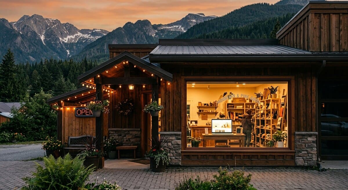
Proof does the heavy lifting. A page claiming great service is normal. A page showing a finished job in Castlegar, a clinic room in Nelson, or a Rossland winter service note feels real. People inspect photos for clues, which is why my guide to before and after photos for contractors belongs beside service-page work, not in a separate marketing drawer.
More calls vs. better leads: which should a service page chase?
Chase better leads. A page that creates more inquiries can still be a bad page if the inquiries are wrong. The fix for most lead-quality problems is not more traffic, it is more qualification on the page: service area, scope, price context, and timing stated before someone picks up the phone.
Before
A Castlegar landscaping page listed five services, showed no project photos, gave no price context, had one vague contact button, and pulled calls from people outside the service radius asking for work the business did not offer.
After
Rebuilt around the exact services, towns served, seasonal booking windows, starting price context, before and after photos, a short quote form, and tap-to-call. Good-fit visitors gained confidence. Bad-fit visitors had enough information to self-select out.
Composite example based on common West Kootenay service-page problems. No performance numbers are claimed, because invented metrics belong in the swamp.
When the wrong calls keep coming, the page usually has one of these leaks. Match the symptom to the fix.
- Add fit filters: towns served, project minimums, budget context, and what you do not handle.
- Move proof higher: project photos, review excerpts, and credentials near the first decision point.
- Tighten the first screen so the service, place, and main action are clear before any scroll.
- Simplify the form and add tap-to-call so a ready buyer on a phone never has to hunt.
- Turn the last ten repeated phone questions into FAQ blocks the page answers for you.
That measurement loop turns service pages into assets. If every Creston inquiry asks about travel fees, add the answer. If Rossland winter callers ask about access, add the note. The market is handing you the copy. Use it.
What does a strong service page look like by Kootenay business type?
The pattern is the same for everyone: say the service, qualify the fit, show proof, make action easy. What changes is the proof and the questions that block a decision. Here is what the page needs to cover for common Kootenay business types.
- Contractors and trades
- Lead with the exact service, town coverage, project types, minimum scope, seasonal lead time, before and after photos, warranty notes, and a way to send job photos for a quote.
- Clinics and wellness
- Show practitioner fit, appointment types, what the first visit involves, booking rules, accessibility, parking, intake steps, and comfort-building proof.
- Consultants and pro services
- Explain the problem you solve, who you work with, the decision process, scope boundaries, pricing model, timeline, deliverables, and what a first conversation covers.
- Tourism and seasonal operators
- Answer dates, availability, location, parking, weather or smoke notes, cancellation rules, what to bring, group fit, and phone-friendly booking paths.
- Home service businesses
- State emergency versus scheduled work, service radius, response time, quote process, seasonal rush windows, common fixes, and after-service care.
- Shops with services
- Separate retail browsing from service bookings. Show repair, customization, fitting, consultation, pickup, drop-off, and appointment paths clearly.
Mention Castlegar, Nelson, Trail, Rossland, Creston, Nakusp, and Cranbrook only when those places change the service: travel time, coverage, seasonal availability, proof, or local demand. If a town name does not help the buyer decide, it is clutter. For the search side of this work, pair this guide with ranking for your service in Castlegar, Nelson, Trail, or Rossland.
How do I fix a service page that is already live?
If the page is live and leads are messy, do not start with a redesign. Start with the fixes that reduce confusion fastest: the first screen, the contact path, pricing context, proof, and FAQs. The highest-value changes are almost always clarity, trust, and removing friction, not a full rebuild.
- 1Rewrite the first screen with the exact service, town or service area, buyer fit, and main action.
- 2Add pricing context, timing, quote factors, seasonal limits, and what happens after an inquiry.
- 3Move tap-to-call, booking, or quote request above the first major scroll on mobile.
- 4Add three to six real proof assets: photos, reviews, project snippets, process notes, or credentials.
- 5Turn the last ten repeated phone questions into FAQs.
- 6Check that your Google Business Profile, service names, hours, phone, and website links all match.
Do that, and the page stops acting like a brochure. It becomes a filter, a trust-builder, and a sales path with less drama. When you are ready for a second set of eyes, send me the page and I will tell you what is missing and what to change first.
Sources and further reading
- Google Search Central: SEO Starter Guide
Explains how clear titles, headings, helpful content, crawlable links, and descriptive URLs help search engines and people understand a service page.
- Google Search Central: creating helpful content
Frames strong content around people-first information that demonstrates experience, answers real questions, and leaves visitors satisfied.
- Google Business Profile help
Covers keeping business information, hours, services, photos, and website links current so your profile and service pages agree.
- Google Search Central: LocalBusiness structured data
Documents LocalBusiness fields such as address, phone, opening hours, geo, and price range where they apply to a service page.
Frequently asked questions
How long should a service page be?
Long enough to help a serious buyer understand the service, fit, service area, pricing context, timing, proof, process, and next step. A thin page creates more low-quality calls because people have to ask basics. A bloated page hides the answer they came for.
Do I need a separate page for each service?
Usually yes when a service has a different buyer, problem, price range, proof set, or search intent. A Nelson clinic service and a Trail contractor repair should not be squeezed into one vague services page if each needs different information to convert.
Should I list prices on my service page?
List exact prices when they are stable. If work is quoted, show starting points, ranges, what changes the price, and what is included. Pricing silence creates friction and attracts calls from people who were never a fit in the first place.
What should the call to action on a service page say?
Use the action the buyer actually needs: call for an estimate, book a consult, request a quote, check availability, or send project photos. Vague contact buttons are weak because they do not set the next step or the expectation.
How do I know if my service page is working?
Track phone taps, form submissions, booking clicks, the quality of inquiries, common questions, and which towns or services produce good leads. The page is not winning if calls rise but half are outside your service area or budget.
Should service pages mention every town I serve?
Mention real service areas in a useful way, not as a town-stuffing trick. Castlegar, Nelson, Trail, Rossland, Creston, Nakusp, and Cranbrook can appear when they shape travel time, booking windows, service radius, or seasonal demand.
How many FAQs should a service page have?
Enough to reduce hesitation and bad-fit inquiries. Start with pricing, timing, service area, process, what is included, what is not, booking lead time, cancellation rules, accessibility, and what happens after someone reaches out.
What should I fix first if the page is already live?
Fix the first screen, service fit, call to action, phone path, pricing context, proof, and FAQs before redesigning the whole page. The highest-value fixes are almost always clarity, trust, and removing contact friction.
Kootenay Made Digital
We build websites, local presence, and calm AI setups for Kootenay small businesses. No jargon, no agency fog, no surprise fees.