


 hello@kootenaymade.ca
 Castlegar, BC. Serving the Kootenays and beyond.
Breaker Room Brewing
A taproom site where a visitor builds their flight before they walk in the door.
29
Pages and routes
8
Beers on the tap board
4
Switches to a flight
8
Journal guides for visitors
The taproom phone rings with the same questions every day.
Not knowing beer keeps people away.
A visitor who cannot tell a pilsner from a porter worries about ordering wrong in front of a line. Some of them never come in.
And it costs the businessThe ones who do come spend the first minutes at the bar asking what to get, while the line behind them waits.
The practical answers are missing.
Kids, dogs, the patio, the kitchen hours and parking decide whether a group comes at all. When the site does not say, they call or go elsewhere.
And it costs the businessStaff answer the same questions on the phone all day, often in the middle of a busy pour.
Groups need a number before they commit.
A birthday or a work party needs the space, the minimum spend and the deposit before anyone books.
And it costs the businessEvery booking starts as an email chain, and some groups book the place that answered first.
Built on the tap wall, with every answer on the page.
The tap wall on the homepage.
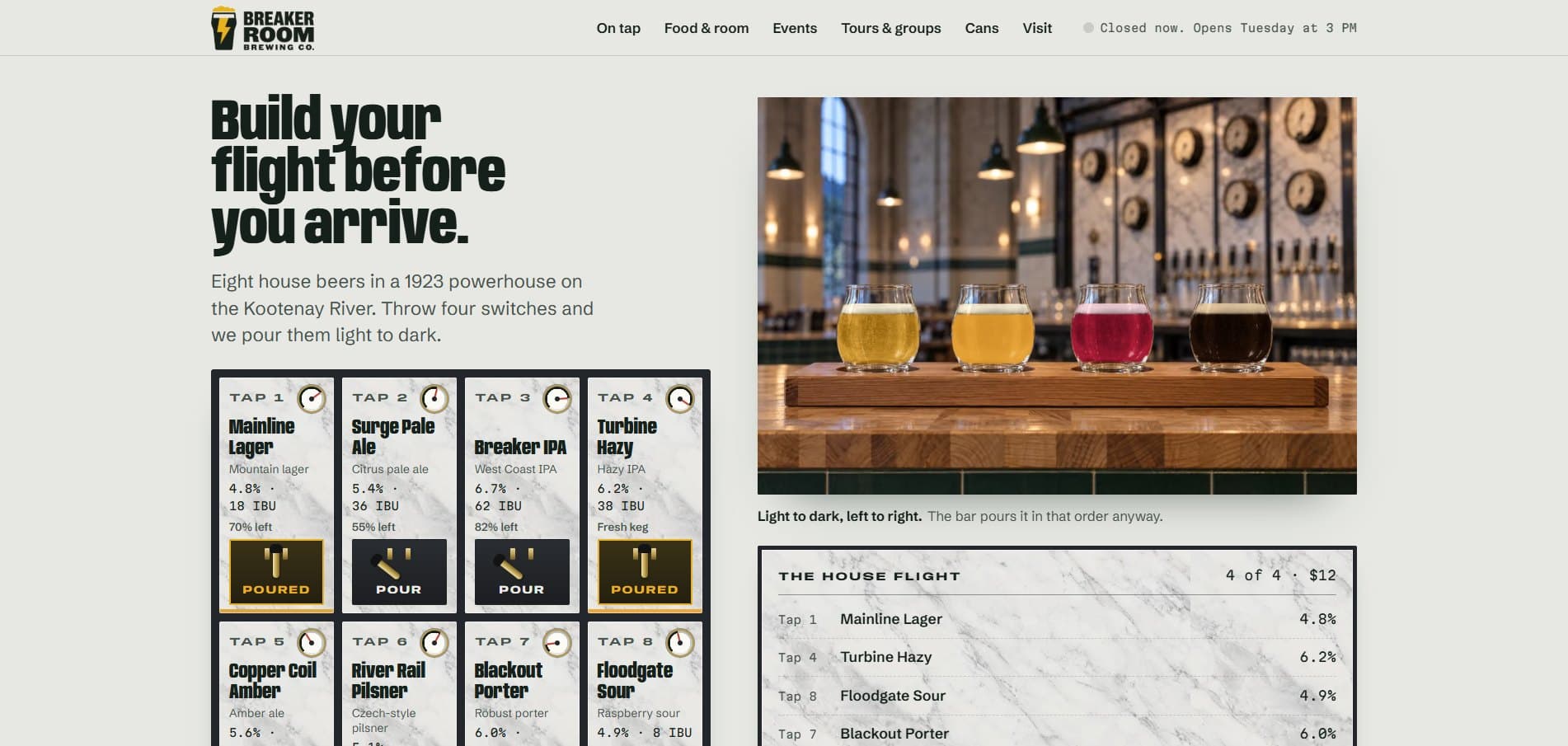
Every beer has its own panel with its strength, bitterness and keg level, and a flight is four switches thrown.
A flight built before the visit.
The paddle re-sorts light to dark and the ticket gives the tap numbers, so ordering takes one sentence at the bar.
Every phone question answered on the page.
Open right now, the kitchen, kids, dogs, the patio, parking and the driver are each answered where people look.
A booking builder for groups.
It works out the space, the minimum spend and the deposit for the date, before the first email.
The thinking behind the build
Breaker Room Brewing is a fictional brewery in a 1923 hydro powerhouse on the Kootenay River, at the invented town of Dynamo on Highway 3A. It was rebuilt in September 2026 to answer two things a taproom site usually misses. The first is the visitor who does not know beer and is afraid of ordering wrong. The second is the list of questions people phone about: is the kitchen open, can the kids come, is the patio open, can we book for twelve.
The first version of Breaker Room was loud and fun, and it answered almost nothing a taproom visitor phones about. The rebuild started from those calls. Is the kitchen open? Can I bring the kids, and the dog? Is the patio open yet? Can we book for twelve, and what will it cost? And one worry nobody says out loud: I don't know beer, and I'll order the wrong thing in front of everyone.
The concept came from the building. The taproom sits in the machine hall of a 1923 powerhouse, and the tap wall behind the bar is the original marble switchboard, eight panels with brass meters and one faucet under each. So the website is that wall. Every beer has its own panel showing its strength, bitterness, how full the keg is and when it was tapped, and a flight is four switches thrown.
The Flight Board answers the worry. A visitor throws up to four switches and each beer pours into the next glass on a paddle. The paddle then re-sorts itself light to dark, the order a bar pours a flight in anyway. A ticket shows the tap numbers to give the bartender. Anyone who cannot choose picks what they like, from crisp to tart, and the house fills the paddle for them.
The phone questions are answered where people look for them. The header says whether the taproom is open right now. The visit page gives the hours, patio season, parking and a level entrance. The food page names a beer for every plate and welcomes dogs on the patio, and Family Sunday brings a kids' menu. It also says the driver at each table drinks free all night from the no-alcohol list.
Groups get their own path. The booking page shows every space with its capacity and minimum spend, and a builder works out the space, the minimum and the deposit as the details are filled in. Events carry calendar files, cans can be ordered ahead for pickup, and the stockist list names the stores that carry them by town. Eight journal guides meet first-time visitors while they plan.
For a real brewery, winery or cidery, the same build runs on its own taps, its own room and its own rules. The switchboard becomes whatever that building has, and the phone questions are the ones its staff already answer every week.
What a first-time visitor knows before they arrive.
They know what to order
The flight is built at home, and the ticket tells the bartender exactly what to pour.
They know the whole group can come
Kids, dogs, the patio and the driver are answered before anyone gets in the car.
They know what a party will cost
The space, the minimum spend and the deposit are on the page, not in a reply that comes days later.
Everything that shipped.
I rebuilt Breaker Room around the machine hall of a 1923 powerhouse, with the tap wall set into the old marble switchboard. The homepage is The Flight Board. Around it sit a page for each of the eight beers, the full food menu with prices and an events page with calendar files. A private booking builder works out the space, minimum spend and deposit, cans can be ordered ahead with stockists listed by town, and the visit page covers hours, patio season, parking and access. Eight journal guides answer what first-time taproom visitors search.
Highlights
- The Flight Board: throw up to four switches and the paddle pours and re-sorts light to dark
- A Can't choose? start: pick crisp, hoppy, hazy, malty, dark or tart and the house fills the flight
- Every beer shows its strength, bitterness and how much is left in the keg
- Open or closed right now in the header, with the kitchen closing an hour before the doors
- Kids, dogs, the patio season, parking and access answered on the visit and food pages
- The driver at the table drinks free from the no-alcohol list, said on the page
- A private booking builder that shows the space, minimum spend and deposit for the date
- Cans to order ahead for pickup, and the stores that carry them, listed by town

Pages and surfaces
- Home (The Flight Board)
- On tap, with a page for each of 8 beers
- Food and the room, with the full menu
- Events
- Tours and private bookings
- Cans to go and stockists
- Visit: hours, directions and parking
- Our story (the powerhouse)
- Journal with 8 guides
- Questions
- Contact
- Accessibility
- Privacy
Real code. Real routes. Production ready.
- The open-or-closed line and the kitchen hours are worked out in Pacific time, so they stay right without anyone editing them
- Each beer's own colour is baked into the pour image, so every glass on the paddle looks like the beer it holds
- The can labels are real artwork wrapped onto a blank can, so every word on them is exact
- Events come with calendar files a visitor can drop straight into their phone
- Sections further down the page render as they are reached, which keeps the homepage quick on a phone
Stack
How it was built
Breaker Room Brewing is a fictional concept, and the site says so. The brewery, the town of Dynamo, the beers, prices, events and stockists are invented. The Kootenay River, Castlegar, Nelson and Highway 3A are used for setting and distances only. For a real producer, the same site runs on your real taps, your real room and your real licence. Counts read from the live site on September 28, 2026.
Answer the phone questions before the phone rings.
The same tap board, visit answers and booking builder can be built around your taps and your room. Start with the free check-up and I will show you what your current site leaves people calling about. No website yet? Tell me about the taproom and I will show you where to begin.
No website yet? Start your first one here
Built as The Engine, $6,500. Own It Monthly can spread the build over 12 payments, yours outright at the end.
In this industry yourself? Read the craft brewery and winery website design playbook.
More work
21 / 23