


 hello@kootenaymade.ca
 Castlegar, BC. Serving the Kootenays and beyond.
The Morrow Clinic
A clinic site that calms a nervous new patient and answers billing before they book.
39
Pages in the sitemap
8
Care pages named for what hurts
6
Practitioner bios
4
Steps in the booking flow
A new patient decides about a clinic before the calendar opens.
A booking widget asks for trust too early.
Many clinic sites drop a stranger straight into a calendar. Someone in pain after a bad night is still deciding whether this place feels safe.
And it costs the businessThe calendar converts the people who had already decided. Everyone else phones the front desk or books with a clinic that explained itself.
The billing questions are buried.
Direct billing, referrals, rates and parking often sit three clicks deep. A nervous visitor assumes the worst when they cannot find them.
And it costs the businessEach of those questions becomes a phone call, usually while someone is standing at the desk waiting to pay.
Clinical sites feel like a waiting room.
Walls of credentials and stock photos of smiling strangers raise a guard. The visitor wants to know what a first visit will feel like.
And it costs the businessA patient who arrives guarded spends the first minutes of a paid appointment settling in. The ones who never book leave a gap in a practitioner's day.
Calm first, with the practical answers close behind.
A page that lowers the pulse.
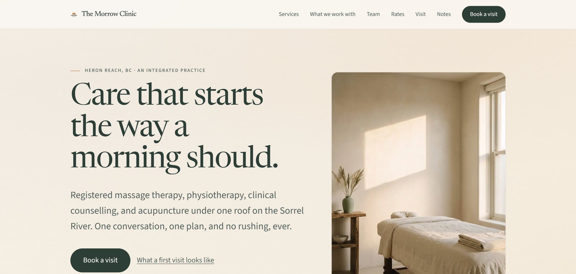
Warm paper colours, morning light and unhurried pacing set the tone. A small prompt to take one breath sits beside the booking buttons.
The answers on the first screen.
The hours, direct billing, the six practitioners and step-free entry sit in a strip under the headline. Rates and the list of insurers are one tap away.
Care pages named for what hurts.
Eight pages cover concerns like low back pain, sleep trouble and burnout. Each says how the clinic approaches it and when it refers out.
A booking flow that states its length.
It promises two minutes and asks four things, with a phone number beside it the whole way.
The thinking behind the build
The Morrow Clinic is a fictional clinic in Heron Reach, an invented BC river town, with massage therapy, physiotherapy, counselling and acupuncture under one roof. People usually find a clinic in pain or in doubt, often after a bad night. The site's first job is to feel calm. Its second is to answer billing, referrals, cost and what happens at a first visit before it asks for anything.
Clinic websites tend to fail in one of two ways. Some are a booking widget with a logo, which assumes the visitor already trusts the practice. Others are a wall of credentials that answers questions nobody asked. The person arriving is usually in pain or in doubt, deciding whether to let a stranger treat them. The Morrow Clinic was built for that person.
Morrow is an old word for morning, and the clinic opens at 7:00, so the site lives in that hour with warm paper colours, soft light and no rush. The signature is the east window. The glass fogs over, and a visitor can wipe it with a finger or a cursor to see the treatment room inside. Then it slowly fogs back. The caption says so do shoulders, and that is why follow-ups exist. It makes the case for follow-up care without a single health claim.
The practical answers sit where the decision happens. A strip under the headline shows the hours from 7:00, direct billing with most insurers, six practitioners in four disciplines, and step-free entry. Rates get their own page, billing gets another, and the FAQ names the insurers. The eight care pages are named for what the visitor feels, like low back pain, a stiff neck, sleep trouble or burnout. Each one explains how the clinic approaches it, which symptoms need urgent care, and when it refers out.
Booking is paced for a nervous first-timer. The flow says up front that it takes two minutes, then asks for the care, the appointment type, the practitioner and the time. A phone number sits beside it the whole way. A visitor unsure which service fits can use the sixty-second pointer on the care page, which asks three questions and suggests one. The six practitioner bios lead with how each person works, and a new-patients page walks through what a first visit looks like.
All 39 pages carry their full text in the page itself, and structured data describes the clinic, the practitioners and the FAQs to search engines. A search of every page found no cure or guarantee language, so a real clinic starts from copy that promises no outcomes before its college's advertising rules are checked. The town, the clinic and the practitioners are invented, and the booking flow stops before anything is booked. For a real clinic, the last step hands off to its own Jane App or Cliniko booking.
What a nervous first-timer knows before they book.
Billing settled first
Direct billing, the fact that no referral is needed, and the rates are all answered before the site asks for anything.
A picture of the first visit
The new-patients page walks through the first appointment, from the forms to what to wear. Nothing about the day comes as a surprise.
A person on the other end
A phone number sits beside every booking path. Anyone who would rather talk it through can call.
Everything that shipped.
I built a 39-page clinic site in a calm morning style. It gives each of the four disciplines a page, and it adds eight care pages named by concern, six practitioner bios, rates, direct billing, a new-patients page and a visit page with parking and entry details. There is also an FAQ, gift cards, and eight notes on the questions patients ask every week. The homepage carries the fogged east window, and the booking flow is four steps long with a phone number beside it.
Highlights
- A fogged window on the homepage that a visitor wipes clear to see the treatment room
- A strip under the headline with the hours, direct billing, the practitioners and step-free entry
- Eight care pages named for what the visitor feels, each saying when the clinic refers out
- A four-step booking flow that says it takes two minutes, with a phone number beside it
- A sixty-second pointer that asks three questions and suggests which service to start with
- A pressure scale on the massage page that gives a first-timer the words for what they want
- Six practitioner bios that lead with how each person works
- Eight notes answering the questions patients ask every week, from heat or ice to direct billing

Pages and surfaces
- Home
- Book a visit
- New patients
- Rates
- Direct billing
- Services hub
- Massage therapy
- Physiotherapy
- Counselling
- Acupuncture
- Care hub and 8 care pages by concern
- Team and 6 practitioner bios
- Visit (parking and entry)
- FAQ
- Gift cards
- Notes and 8 entries
- Privacy
Real code. Real routes. Production ready.
- Every page's full text is in the served HTML, so search engines and slow connections read all of it
- Structured data describes the clinic, the six practitioners, the notes and eight pages of FAQs
- The booking flow is built so its last step hands off to Jane App on a real clinic's site
- The fogged window has a button that clears it for anyone who cannot or would rather not wipe it
- Visitors who turn off motion get a designed still of the moving morning light
- Built toward WCAG 2.2 AA, with rates and billing answered in text rather than images
Stack
How it was built
The Morrow Clinic is a fictional concept, and every page of the site says so. Heron Reach, the Sorrel River, the clinic and all six practitioners are invented, and the booking flow stops before anything is booked. No health outcomes are claimed or implied. For a real clinic, the same site runs on your real rates, your real insurers, your college's advertising rules and your own booking platform. Counts read from the live site on October 5, 2026.
Your clinic is calm. Your website should feel it.
Morrow is the proof. The same calm pacing, care pages and short booking flow can be built around your practitioners and your name. Already have a site? The free check-up will show where it makes nervous patients more nervous. No website yet? Tell me about your clinic and I will show you where to begin.
No website yet? Start your first one here
Built as The Engine, $6,500. Own It Monthly can spread the build over 12 payments, yours outright at the end.
In this industry yourself? Read the wellness clinic website design playbook.
More work
05 / 23