

 hello@kootenaymade.ca
 Castlegar, BC. Serving the Kootenays and beyond.
 9 min read
Key takeaways
- Tourism businesses compete during the planning stage, not only on arrival day.
- Visitors need orientation because they do not know the area like a local does.
- Google profile details, current photos, reviews, route clarity, and booking friction often decide the sale before the site gets a long look.
- The strongest sites make the trip easy to picture: where, what to expect, what it costs, and how to book.
- The clearest business usually wins. Obvious beats clever when someone is planning from a phone.

On this page
How do Kootenay tourism businesses win visitors?
Kootenay tourism businesses win visitors during the trip-planning stage, not at the front door. You earn the booking by making the experience easy to understand, trust, and book from a distance: a clear website, current photos, honest reviews, route confidence, visible pricing, and a booking path that works on a phone.
A family in Calgary is planning a long weekend in the Kootenays. They have six tabs open, two dinner ideas, one rental option, a possible cabin, and a half-finished itinerary. Your business is not competing when they walk through the door. It is competing while the trip is still being assembled.
If your website helps them build confidence from a distance, you make the itinerary. If it does not, a clearer option does. The good news is that clarity is something you control, and it usually beats a bigger ad budget. If the cabin on their list is your place, here is how a small lodge website wins direct bookings.
Tourism sites do not need to yell louder. They need to make the trip easier to imagine, trust, and book before arrival.
What is the trip-planning window, and why does it matter?
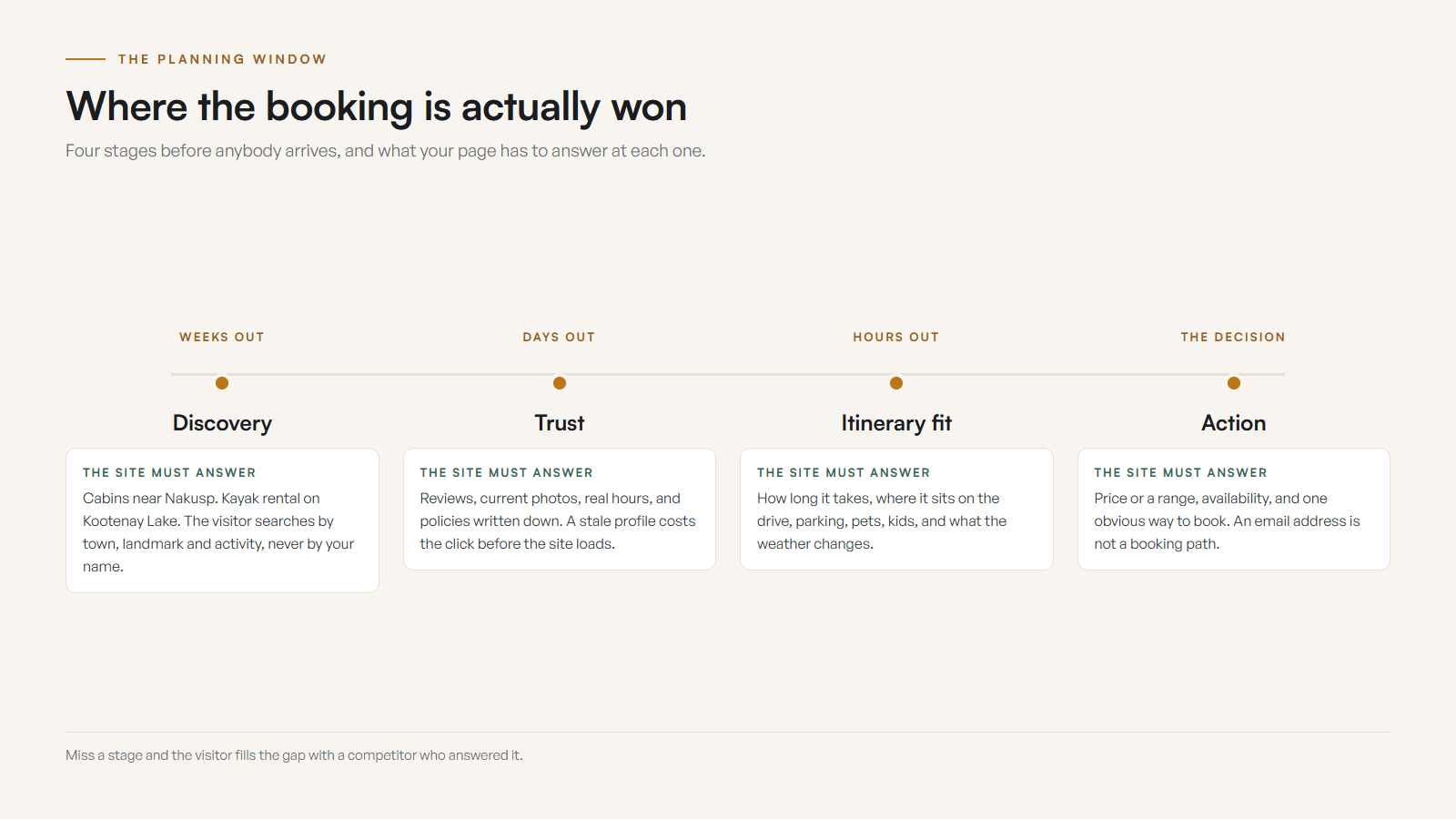
The planning window is the stretch of time before arrival when visitors compare options and assemble an itinerary. It matters because most of the decision happens here. Visitors search by category, town, landmark, route, season, and family fit, then choose what feels easiest and safest to add to the trip.
Visitors do not search like locals. They might look for cabins near Nakusp, a patio dinner in Nelson, kayak rental on Kootenay Lake, Rossland bike repair, things to do around Castlegar, or family-friendly stops near Trail. If your site only speaks to people who already know the local shorthand, it leaves strangers outside the door.
- 01
Discovery
The visitor searches by category, town, landmark, route, activity, or problem long before they know your name.
- 02
Trust
Reviews, photos, current hours, real policies, and local context decide whether the business feels safe from a distance.
- 03
Itinerary fit
Visitors weigh timing, location, parking, duration, nearby stops, family fit, pet rules, and weather sensitivity.
- 04
Action
The page has to turn planning energy into a booking, reservation, call, order, inquiry, or saved stop.
For the seasonal operations side of this, pair this guide with Tourism season is coming: is your website ready for the rush?
What do visitors need answered before they arrive?
Before arrival, visitors need to know what the experience is, who it is for, where it sits on their route, what it costs, how long it takes, whether it is available, and how to book. Answer these on the page before a visitor has to ask, because every unanswered question is a reason to compare you with someone else.
- What exactly is the experience, and who is it best for?
- Where is it in relation to the town, route, hotel, trail, lake, highway, or ferry?
- Are there current photos and reviews that prove it is worth adding to the trip?
- What does it cost, how long does it take, and what should a visitor bring?
- Is there availability, and what happens if weather, smoke, or road conditions change?
- Can a visitor book, reserve, call, or ask a question without starting a research project?
None of these require a bigger site. They require a site that has decided, in plain language, to answer the questions a stranger would actually ask while planning a trip from two provinces away.
What actually helps a visitor decide to book?
Strip a tourism site down to what changes whether someone books, and it lives in five places: orientation, proof, search language, route confidence, and frictionless action. Get those right and the page does the convincing, so you spend less time answering the same basic questions by email.
- 01
Write for someone who has never been here
Explain the experience, who it is for, where it happens, how long it takes, what to bring, what it costs, and why it belongs in the trip. Local shorthand leaves strangers outside the door.
- 02
Show the experience, not just the asset
The cabin view, trail, guide, room, patio, table, boat, breakfast, or arrival moment helps visitors picture themselves there. Current, specific photos beat vague scenery every time.
- 03
Make route and location obvious
Use landmarks, town context, parking notes, map links, ferry or highway context, and nearby stops whenever they affect the decision. Distance and access are part of the booking.
- 04
Match real travel searches
Use the natural category and place language travellers actually type, so both visitors and Google understand the offer without robotic town-name stuffing.
- 05
Make booking feel safe
Show availability, price context, policies, what happens next, and a single clear action. Intent cools fast when the basics are hidden behind an email.
Notice that none of this is about being clever. It is about being legible to someone who has never been to the Kootenays and is deciding from a phone whether your business is worth the detour. If you want a second set of eyes on those five layers, the free check-up flags the weak ones.
Website vs Google profile: which wins tourism bookings?
Both matter, and they do different jobs. The Google Business Profile is usually the first impression and decides whether a visitor clicks through at all. The website answers the deeper planning questions and takes the booking. Stale profile details cost you before the site even loads, so keep both current and consistent.
| What is being compared | Google Business Profile | Your website |
|---|---|---|
| Main job | First impression and click-through | Deeper answers and the booking |
| Visitor sees | Photos, hours, reviews, map pin, category | Experience, route, pricing, policies, proof |
| Decides | Whether to look closer at all | Whether to book, call, or move on |
| Best photos | Current, recognizable, location-clear | The real experience, room, trail, or table |
| Booking path | A link or call button | Availability, price context, clear next step |
| Risk if stale | Wrong hours, old photos, lost click | Hidden price, buried booking, lost intent |
Visitors do not separate the two the way you do. To them it is one impression. When the profile and the site agree on hours, photos, and the offer, the business simply feels safer to choose. The same goes for your regional tourism listings, and I wrote up getting listed on HelloBC and Kootenay Rockies Tourism.
What does winning visitors look like by business type?
The doctrine is the same for every tourism business: answer the planning questions before the visitor has to ask. The proof just changes. A cabin, a tour, a cafe, a shop, an event, and a service business each need a different set of details to feel bookable from a distance.
- Stays and accommodations
- Room type, location, rates, availability, minimum stays, parking, pet rules, check-in, nearby attractions, cancellation policy, and who the stay is best for.
- Tours, rentals, and guides
- Price, duration, difficulty, meeting point, what to bring, group size, safety notes, cancellation rules, weather policy, and booking cutoff times.
- Food, drink, and patios
- Current menus, hours, patio status, reservation rules, takeout, events, parking, accessibility, exterior photos, and what makes the stop worth adding.
- Retail, galleries, and makers
- What is local, what is seasonal, price range, hours, location, parking, shipping, gift cards, market dates, and product photos with real context.
- Events and attractions
- Dates, ticketing, capacity, schedule, access, parking, family details, accessibility, weather plan, refund policy, and what happens on arrival.
- Service businesses
- Visitor-friendly help, service area, response time, summer lead times, a clear quote path, reviews, and whether visitors or locals are the better fit.
A realistic before and after
Composite example, no invented numbers. The point is the shape of the fix, not a metric.
Before: a small Kootenay tour had decent word of mouth but a site that buried what the tour included, hid the booking button, mixed up seasonal dates, skipped route details, and used photos that undersold the experience. Visitors compared, hesitated, and disappeared.
After: the updated site led with the experience, town context, current dates, a clear booking path, better photos, reviews, price context, route notes, and policy answers. Visitors could understand the value before arrival and act without chasing basics. The full version of that fix for guided trips is in what an adventure tour operator website needs to win bookings.
What are the most common tourism website mistakes?
The most common mistakes all share one root: writing for people who already know the area. Tourism sites lose bookings by speaking in local shorthand, hiding pricing and booking steps, using scenic photos that do not show the actual product, and letting the Google profile drift out of sync with the site.
- Writing for locals who already understand the geography.
- Using scenic photos that never show the real product, space, guide, room, or meal.
- Leaving the Google Business Profile stale while expecting the site to carry the whole decision.
- Hiding pricing, availability, location, policies, or booking steps behind friction.
- Letting seasonal dates, route details, hours, and travel notes drift out of sync.
- Assuming Instagram can replace a page that answers questions and converts.

Route confidence deserves its own mention. In the Kootenays, plans get shaped by highways, ferries, mountain passes, weather, smoke, construction, and seasonal closures. A business that helps visitors understand access feels safer to choose, which is why so many of these mistakes are really just unanswered questions.
How do I fix my tourism website before the next wave of visitors?
Fix the website in the order visitors experience it: the first screen, the photos, the Google profile, the planning answers, and the booking flow. Five focused changes do more than a full redesign, because they remove the friction that quietly loses bookings during the planning window.
- 01Rewrite the first screen so a visitor understands the experience, location, proof, and next step in seconds.
- 02Replace weak photos with current visuals that show the trip, not just the building.
- 03Clean up the Google Business Profile so hours, photos, links, categories, and services match the site.
- 04Add price, duration, route, parking, weather, cancellation, and what-to-bring answers.
- 05Shorten the booking or inquiry flow until it feels obvious on a phone.
If you would rather not guess which fix matters most, run the free check-up and I will point to the pre-arrival leaks first. When you are ready for the operational readiness layer, read the summer prep checklist next, and when the fix list turns into a rebuild, the tourism and resort website design playbook shows what a booking-first build includes. The real budget question is not what a fix costs. It is what the business loses every weekend a visitor cannot tell why you are worth the drive.
Sources and further reading
- Destination BC Learning Centre
Tourism-industry marketing and business resources for BC operators, useful for grounding visitor-experience and content decisions.
- Google Business Profile help
Guidance on the business information, photos, hours, and services visitors often see before they ever reach your website.
- Google Search Central: page experience
Why mobile display, HTTPS, and Core Web Vitals matter for sites that have to convert trip planners on a phone.
- DriveBC
Highway, ferry, construction, and weather conditions shape Kootenay trips, so route confidence is part of the visitor decision.
Frequently asked questions
When do tourism visitors actually decide where to book?
Usually before they arrive. Visitors compare options while planning the trip, while travelling, and again once they are nearby. Your website, Google profile, reviews, photos, and booking path shape that decision long before they meet you.
What should a Kootenay tourism homepage say first?
Lead with the experience, location, season or availability, who it is for, your strongest proof, and one clear next step. Visitors should not need local knowledge to understand why your business belongs in their itinerary.
How much do photos matter for tourism businesses?
They matter heavily, because photos help visitors imagine the stay, tour, meal, rental, view, room, trail, or shop. Use current, specific photos that show the actual experience rather than vague scenery or a stale gallery.
What is the biggest booking mistake tourism sites make?
Hiding the next step. If visitors have to email for basics, guess prices, hunt for availability, decode the location, or wait for a vague reply, intent cools fast and the next browser tab wins the booking.
Should tourism businesses show their prices?
Show exact prices when you can. If pricing varies, show starting rates, ranges, sample packages, or what affects the quote. Visitors are building a trip budget, so a price mystery usually pushes them toward a clearer competitor.
Does a Google Business Profile matter more than the website?
They work together. Many visitors see the profile first, so stale hours or photos cost bookings. The website then has to answer deeper questions and take the booking. Keep both current and consistent for the best result.
Related pages
- Tourism and resort websites
- Lodging and hotel websites
- Adventure operator websites
- Web design in Fernie
- Web design in Golden
Kootenay Made Digital
I build websites, local presence, and calm AI setups for Kootenay small businesses. Plain language, published prices, and clear work that makes you easier to find and easier to choose.