Key takeaways
- A clinic website wins when it lowers uncertainty: service fit, practitioner trust, booking, intake, privacy, payment, and arrival.
- Service pages should explain scope and process in plain language, without medical claims the business cannot support.
- Practitioner bios, credentials, real photos, reviews, and first-visit FAQs are decision tools, not decoration.
- Booking, intake, direct billing, cancellation rules, parking, and accessibility should be clear before anyone has to call.
- Fix the first screen, booking, and trust facts before a full visual redesign.
On this page
What does a great clinic or wellness website actually need?
A great clinic or wellness website helps a cautious first-time visitor decide whether you are the right fit, understand what happens next, see how private details are handled, and book without guessing. It does that with plain service descriptions, visible practitioner credentials, real photos, clear policies, and one obvious booking path.
People arriving on a care website are not reading like marketers. Someone in Trail is looking for a counsellor after work. A Castlegar parent is booking physio for a teen injury. A Nelson resident wants massage therapy with direct billing. They are scanning for safety, fit, proof, and the next step. A great site answers those questions before nerves turn into delay.
Calm design helps, but calm alone is not trust. Trust comes from visible facts: services in plain language, practitioner credentials, appointment expectations, real photos, reviews, policies, privacy boundaries, and a booking path that does not make people feel foolish for asking basic questions.
A restaurant site can make someone hungry. A clinic site has to make someone feel safe enough to act.
What should be above the fold on a clinic website?
The first screen should answer five things fast: what service you offer, who it is for, where you are located, whether booking is available, and the single next step. If a nervous visitor has to decode mood words to find out whether you can help with their situation, many will leave before they ever scroll.
- The care or wellness service you offer, named in plain language.
- Who the service is for, so people self-identify fast.
- The town or towns you serve, so locals know you are nearby.
- Whether booking is available, and the single next step to take.
- One honest reason to trust you, such as credentials or registration.
Everything else on the page is supporting cast. If the first screen does its job, you have earned the scroll. If it leads with abstract wellness language and hides the service and the booking button, the rest of the design does not matter.
Calm design vs. clear trust: which matters more?
Calm visuals and clear trust facts are not the same thing, and clinics often invest heavily in the first while neglecting the second. Soft colours and gentle fonts set a tone, but people book because they can verify the service, the practitioner, the process, and the next step. Clarity converts. Calm alone does not.
| Calm but vague | Calm and clear | |
|---|---|---|
| First screen | Mood words and a hero photo | Service, who it is for, town, booking step |
| Services | Soft healing language | Plain scope, first-visit details, session length |
| Practitioners | A name and a job title | Photo, credentials, focus, care style, book link |
| Booking | Buried or third-party maze | One obvious path, tested on mobile |
| Intake and privacy | A generic contact form | Clear purpose, secure path for sensitive detail |
| Payment | Not mentioned | Direct billing, receipts, what to bring |
| Photos | Stock wellness imagery | Real rooms, entrance, parking, the team |
None of this means the site should feel clinical or cold. It means the calm should sit on top of answers, not in place of them. The most trustworthy care sites feel both warm and specific.
What should clinic service and practitioner pages include?
A service page explains the care, and a practitioner page helps someone choose the human. Together they should cover service fit, what the first visit involves, practitioner proof, trust and privacy, payment clarity, and arrival support. Each part removes one reason a cautious person might delay booking.
- Service fit
- Plain-language service name, who it is for, common reasons people book, what is inside scope, what is outside scope, and when to call before booking.
- First visit
- Session length, what happens before and during the appointment, what to bring, what to wear if relevant, intake steps, and what happens after booking.
- Practitioner proof
- Photo, role, credentials, registration or licensing where relevant, training, focus areas, care style, schedule, and a direct booking path.
- Trust and privacy
- How private details are handled, what not to put in a general form, cancellation rules, consent and intake timing, and who answers appointment questions.
- Payment clarity
- Pricing context where appropriate, direct billing, insurance receipts, payment methods, packages, cancellation fees, and what varies by provider or plan.
- Arrival support
- Address, map link, parking, entrance, accessibility notes, stairs or elevator, hours, special hours, phone backup, and the towns you serve.
Keep the language process-based, not outcome-promising. Explain what happens and who it is for, rather than guaranteeing results. That is both more honest and more reassuring to someone who is already a little anxious. For a deeper look at how the first impression forms, the 10-second trust guide is a useful companion read.
How should clinics handle booking, intake, privacy, and direct billing?
Booking is not a button, it is a chain of trust. If one link feels unclear, people postpone the decision. The site should separate public inquiry from sensitive intake: a general form asks only for what the first reply needs, while detailed health history and documents move through an intentional, secure workflow.
- 01
Make the booking path obvious
If direct booking is available, show it. If the clinic approves requests first, say so. If phone is better for some needs, explain when to call. Then test the whole path on a phone.
- 02
Set intake expectations
Explain whether intake happens before booking, after booking, at arrival, or through a secure tool. Tell people what to bring and what not to send in a general form.
- 03
State privacy boundaries plainly
Say who receives inquiries, what the form is for, and that detailed private information should wait for the right intake path. This is reassurance, not legal theatre.
- 04
Clarify insurance and direct billing
If direct billing is offered, list the stable details. If it depends on plan, provider, or appointment type, say so and explain receipts, payment methods, and what to bring.
- 05
Show hours, location, and parking
Appointment hours, phone hours, special hours, address, parking, entrance, stairs or elevator, and a map link. Rural and downtown Kootenay locations both need arrival clarity.
What does a great website look like by clinic type?
The core pattern is the same for every care business, but the details shift by service, town, and practitioner model. A physio clinic, a counselling practice, and a movement studio all need trust and a clear booking path, but the proof and policies that matter most are different. Here is what each type typically needs.
- Physio, chiro, and rehab
- Clear credentials, service fit, appointment length, direct billing context, injury and movement categories, parking, accessibility, and a booking path that works for people in discomfort.
- Massage and bodywork
- Registration where relevant, pressure or modality context, first-session expectations, forms, receipts, coverage notes, cancellation rules, real room photos, and easy rebooking.
- Counselling and mental health
- Calm language, privacy boundaries, secure intake, practitioner fit, modality explanation, crisis boundary clarity, online or in-person options, fees, and a contact path that does not collect sensitive detail too early.
- Naturopathic and holistic wellness
- Scope clarity, credentials, appointment sequence, lab or supplement boundaries where relevant, no cure-all promises, payment context, forms, and plain language.
- Yoga, Pilates, and movement studios
- Class types, level fit, schedules, passes, instructor bios, what to bring, accessibility notes, seasonal programs, parking, and current photos of the actual room.
- Allied health, dental, and optical
- Referral rules where relevant, credentials, services, hours, forms, benefits context, location details, practitioner pages, emergency boundaries, and Google profile alignment.
Across all of them, local reality shapes the site. Shift work, school pickup, winter roads, smoke season, and limited rural availability make hours, online booking, waitlists, and cancellation rules part of the decision in Castlegar, Nelson, Trail, Rossland, Creston, Nakusp, and Cranbrook. If you want examples of how this plays out in real builds, the portfolio shows the approach.
Is my clinic website good enough? A quick self-check
Run your site against the list below on a phone, the way a nervous first-timer would. If five or more of these are weak, the site is asking anxious people to do too much work, and appointments are likely leaking in small, quiet places: a buried booking link, an empty bio, an outdated photo, or a form that asks for too much.
- A cautious first-time visitor can tell what you offer, who it is for, and where you are located within five seconds.
- Clinic type, practitioner type, credentials, licensing, registration, or training are easy to verify where they matter.
- Each service page explains what the appointment involves without making unsupported health claims.
- Someone can book, request an appointment, call, or ask a question from one clear mobile path.
- The intake flow explains what is needed and what sensitive details should not go through a general form.
- Direct billing, insurance receipts, payment methods, cancellation rules, and first-visit cost context are clear where relevant.
- Practitioner bios include real photos, role, credentials, approach, schedule context, and a direct next step.
- Hours, special hours, appointment-only rules, waitlists, phone availability, and response times are current.
- Address, map link, parking, entrance, elevator or stairs, transit, and accessibility notes are obvious before arrival.
- The website, Google Business Profile, booking tool, and social profiles show the same public information.
What should I fix first on a clinic website?
Do not start with a spa-font redesign. Stop the trust leaks first. Fix the parts a cautious first-timer actually touches, in this order, and you will recover booking confidence faster than a full visual overhaul ever could. Most of these are copy and structure fixes, not big rebuilds.
- 1Rewrite the first screen so it names the service, who it is for, your town, the booking path, and one honest reason to trust you.
- 2Put one primary booking or appointment request button in the header, hero, service pages, practitioner bios, and contact area, then test every step on a phone.
- 3Tighten the core service pages with scope, first-visit expectations, session length, practitioner fit, and payment context.
- 4Add current practitioner photos, credentials, registration details where relevant, care style, and a direct link to book with the right person.
- 5Clarify intake and privacy: what the form is for, what not to send, who receives it, expected response time, and whether secure intake happens after booking.
- 6State direct billing, insurance receipts, payment methods, what to bring, and what varies by provider or plan.
- 7Fix arrival details: hours, special hours, address, parking, entrance, stairs, elevator, accessibility, and the map link.
- 8Align Google Business Profile, booking links, photos, reviews, services, and categories with the visible website.
If the clinic is full, waitlisted, or seasonal, say so honestly. Show whether you are accepting new clients, running a waitlist, or booking follow-ups only, keep Google special hours aligned through holiday and seasonal changes, and remove outdated notices quickly. Old closure notes make a clinic look unattended. When the bigger issue is being found at all, the guide to Google Business Profile for local businesses is the next clean step.
Sources and further reading
- Google Search Central: page experience
Points site owners toward Core Web Vitals, HTTPS, mobile display, and avoiding intrusive elements. Clinic booking pages need to feel usable on a phone, not just attractive on a desktop.
- Google Business Profile help
Guidance on keeping public details current: hours, special hours, phone, address, appointment links, services, photos, and attributes that prospective patients check.
- Google Search Central: LocalBusiness structured data
Documents LocalBusiness fields such as address, telephone, opening hours, geo, and departments. Markup should match visible page content.
- WCAG 2.2 quick reference
Directly relevant to health and wellness sites: readable contrast, labels, keyboard access, focus order, clear errors, and controls people can use without friction.
Frequently asked questions
What should be above the fold on a clinic or wellness website?
The first screen should say what care or wellness service you offer, who it is for, where you are located, whether booking is available, and the next step. People should not decode mood words before they know if you can help.
How detailed should clinic service pages be?
Each page should explain who the service is for, what happens before and during the first appointment, session length, the booking path, pricing or payment context, and direct billing where relevant. Keep it plain and avoid claims the business cannot support.
What belongs on a practitioner bio?
A bio should include role, credentials, licensing or registration where relevant, focus areas, care style, training, a real photo, a booking link, and schedule context. Aim for fit and trust, not a resume wall.
How should clinics handle intake and privacy online?
Use a secure, intentional intake workflow for sensitive details. A public contact form should ask only for what the first reply needs and should tell people not to send detailed health history or private documents unless the workflow is built for it.
Should direct billing and insurance appear on the website?
Yes, if it affects booking confidence. Say whether direct billing is offered, which benefit types are commonly supported if the list is stable, what to bring, and what happens if coverage cannot be confirmed. If it varies, say so plainly.
Do wellness businesses really need real photos?
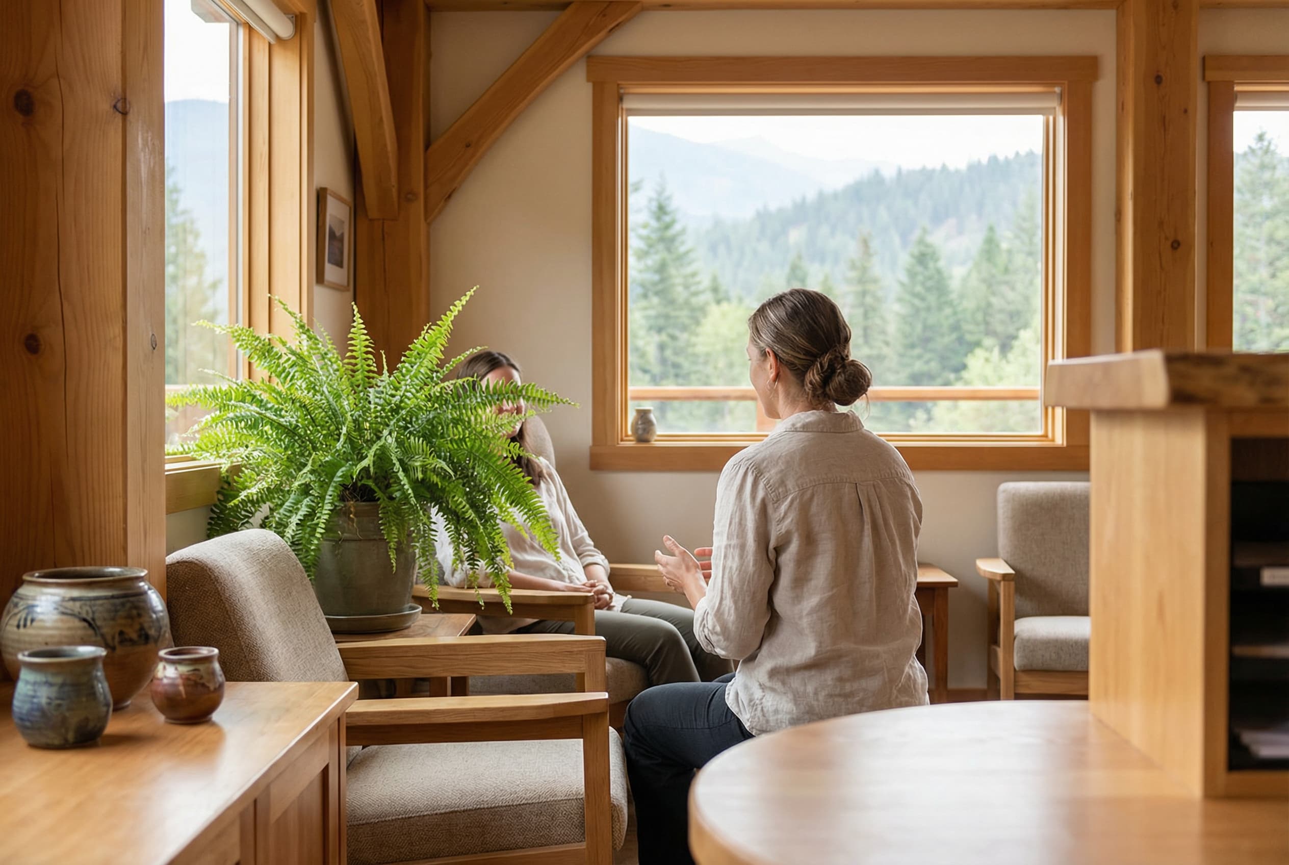
Yes. Real photos of the clinic, treatment rooms, entrance, practitioners, parking, and waiting area reduce uncertainty faster than stock images. People want to know who they will meet and where they are going before they arrive.
How important is online booking for a clinic?
Very important when appointments drive the business. Many people check after hours, on a break, or after a referral. If they cannot book, request an appointment, or understand the next step on mobile, the hesitation gets expensive.
What should I fix first if my clinic site feels outdated?
Fix the first screen, booking path, service pages, practitioner bios, intake and privacy copy, direct billing details, hours, parking, mobile speed, photos, and Google profile alignment before spending weeks on a full visual overhaul.
Kootenay Made Digital
We build websites, local presence, and calm AI setups for Kootenay small businesses. No jargon, no agency fog, no surprise fees.