Key takeaways
- The 10-second test checks whether a stranger quickly grasps what you do, where you work, why you are credible, and how to act.
- Fast trust is a stack of small signals: first-screen clarity, real proof, low-friction contact, and mobile confidence.
- Trust dies when public facts drift: the website, Google profile, and socials disagree on hours, phone, or service area.
- Most trust leaks can be triaged in an afternoon. A rebuild is only needed when the site is slow, broken, or dated.
- Specifics beat slogans: services, towns, photos, and reviews that all agree.
On this page
What does trustworthy in 10 seconds actually mean?
It means a stranger can land on your page and quickly tell what the business does, where it works, whether it looks real and current, whether proof is visible, and what the next step is. It is not a literal stopwatch. It is a practical stress test for the first impression a cautious buyer forms before they read a word.
A visitor lands on a Castlegar contractor site from Google. A Nelson parent checks a clinic on a phone. A couple planning a Rossland weekend compares restaurants and rooms. Nobody in those moments is studying your brand strategy. They are asking a colder question: does this feel real, current, useful, and safe enough to contact?
If the first screen is vague, the photos feel fake, the proof is hidden, or the Google profile tells a different story, trust drains out before the page gets a fair trial. The good news: the signals that earn fast trust are concrete, visible, and mostly fixable.
Hand the site to someone who does not know the business. If they cannot tell what it does, where it serves, and what to do next before they get bored, the site is leaking trust at the front gate.
What signals make a local business website feel trustworthy?
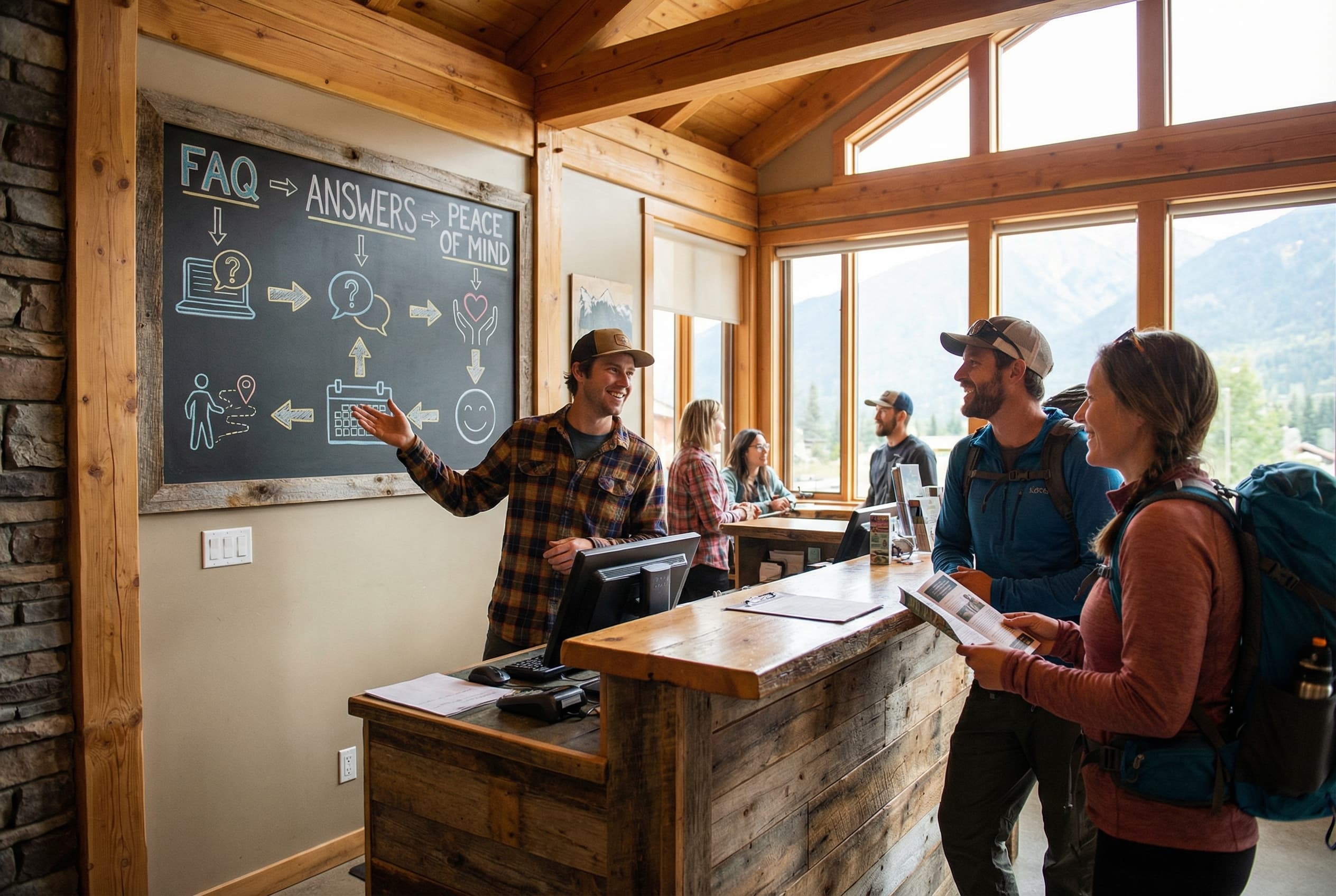
Fast trust is a stack of four small signals, not one magic badge: first-screen clarity, reality proof, low-friction contact, and mobile confidence. When all four land in the opening moments, a stranger feels safe enough to act. When any one is missing, the visitor hesitates and often leaves for a competitor.
- 01
First-screen clarity
The visitor can name your business type, offer, town or service area, and next action without scrolling or decoding clever copy.
- 02
Reality proof
Real photos, specific reviews, project examples, staff signals, rooms, vehicles, food, or products prove the business exists beyond a template.
- 03
Low-friction contact
Call, quote, book, reserve, order, and directions paths are easy to find, easy to tap, and clear about what happens next.
- 04
Mobile confidence
Fast loading, readable type, stable layout, strong contrast, clear buttons, and labelled forms make the business feel competent on a phone.
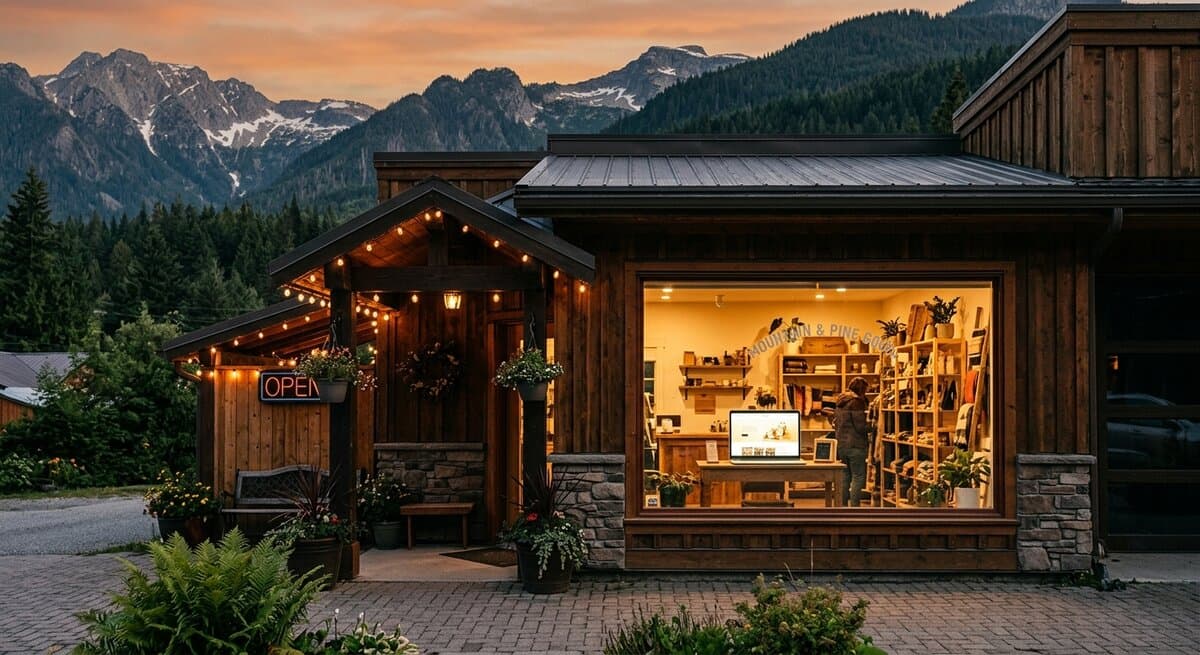
Notice how ordinary these are. The truck in the driveway, the storefront in winter, the patio in July, the finished deck, the staff member people will actually meet. For a Kootenay business, the evidence that lowers risk is usually wonderfully unglamorous. My portfolio leans on exactly these real, local signals rather than stock polish.
How do I test whether my website earns trust fast?
Open the site cold on a phone, the way a real customer would, and answer the checklist below before scrolling. Each unchecked line is a place where a cautious visitor pauses, doubts, and may leave. The more boxes you can tick on the first screen, the safer the business feels to contact.
- A stranger can tell what you do and who you help before scrolling.
- The first screen names your town or service area: Castlegar, Nelson, Trail, Rossland, Cranbrook, or wherever you work.
- The opening photo is real and current, not generic stock of strangers.
- Proof sits near the decision: reviews, project photos, credentials, or years in business.
- Someone can call, book, order, reserve, request a quote, or get directions without hunting.
- The website and Google Business Profile agree on phone, hours, address, and service area.
- The page loads smoothly and reads cleanly on a phone with ordinary Kootenay signal.
- The business looks active this season, not abandoned years ago.
If most of those fail, the problem is rarely talent or price. It is that the page never answered the risk question. A free website scan walks the same checklist and shows where the leaks are.
Trusted vs. untrusted: what is the difference?
Two sites can sell the same service at the same price and feel completely different in the first 10 seconds. The trustworthy one answers the visitor's questions plainly and shows real proof near the decision. The untrustworthy one hides behind clever copy, stock photos, and a contact path you have to hunt for.
| Feels untrustworthy | Feels trustworthy fast | |
|---|---|---|
| First screen | Vague slogan, no clear offer | Plain statement of what you do and for whom |
| Location | No town or service area named | Castlegar, Nelson, Trail, or your area up front |
| Photos | Generic stock of strangers | Real, current shots of the work, team, or space |
| Proof | Hidden near the footer or absent | Specific reviews and projects beside the decision |
| Contact | Buried number, form like homework | Obvious tap-to-call, book, quote, or directions |
| Consistency | Hours and phone differ across profiles | Website and Google profile tell one story |
| Mobile | Slow, shifting, tiny buttons | Fast, stable, readable, easy to tap |
Why does a website lose trust so quickly?
Most trust leaks are small, visible, and oddly common: a mystery headline, stock photo fog, a hidden contact path, proof in the wrong place, business facts that drift across profiles, thin service detail, mobile friction, and stale signals. Each one is a quiet reason for a cautious visitor to choose someone else.
- Mystery headline
- Poetic copy that never says what the business does, who it helps, where it works, or what to do next.
- Stock photo fog
- Generic hands, laptops, and smiling strangers where real staff, spaces, food, products, and finished work should be.
- Hidden contact path
- Phone numbers buried in the footer, forms that feel like homework, no booking link, and mobile buttons that are hard to tap.
- Proof in the wrong place
- Reviews, certifications, and local projects hidden after the visitor has already decided to leave.
- Business fact drift
- Different hours, phone numbers, service areas, or prices across the website, Google profile, socials, and directories.
- Thin service detail
- A list that says roofing, massage, or tours without explaining scope, area, timing, process, or next step.
- Mobile friction
- Slow loads, layout shift, tiny text, cramped tap targets, low contrast, and forms that fight thumbs.
- Stale signals
- Old promos, winter photos in July, dead links, broken maps, and copyright dates that whisper neglect.
Business fact drift is the sneakiest. Many customers never see your website alone. They see a map result, a Google profile, reviews, socials, and the website in quick succession. If those public facts disagree, the visitor does not admire the nuance. They feel risk and move on.
What should different Kootenay businesses fix to look trustworthy?
The trust signals shift by business type, but the visitor's question stays blunt: can I rely on you? A contractor proves it differently than a clinic, a shop, a restaurant, or a tourism operator. Here is the proof layer that matters most for common Kootenay business types.
- Contractors and trades
- Service-area clarity, project photos, quote or warranty expectations, tap-to-call, and reviews that mention the actual work in real towns.
- Clinics and wellness
- Practitioner clarity, a booking path, parking and accessibility notes, privacy-aware photos, treatment detail, and intake or insurance basics.
- Shops and makers
- Current hours, product photos, gift cards, pickup or shipping options, local-made proof, seasonal stock, and a reason to visit now.
- Restaurants and cafes
- Menus, hours, patio status, reservations, dietary notes, current food photos, parking, and takeout links that all stay current.
- Tourism and route-based
- Availability, booking, directions and drive time, weather or smoke update patterns, cancellation notes, and real experience photos that match the season.
How much does it cost to fix online trust?
Often very little. If the site is structurally sound, a one-afternoon triage of headline, photos, proof, contact path, Google profile alignment, and mobile readability fixes the biggest leaks at no cost beyond your time. A full rebuild is only worth it when the site is slow, broken, dated, or impossible to edit.
Start with the cheapest, highest-impact fixes yourself using the steps below. If the foundation is the problem, a fresh build pays back faster than patching a fragile one. At Kootenay Made Digital, custom presence sites start from $2,000, and you can see the full ladder on my services page. If you would rather spread it, the Own It Monthly plan is $2,000 once, or 12 payments of $189, $2,268 all in, and you own the site at the end. Either way, fix the trust leak closest to the money before spending on anything decorative.
How do I fix online trust, and what comes first?
If you only have one afternoon, repair the signals in order, closest to the decision first. Rewrite the first screen, make one next step obvious on mobile, align your business facts, add real photos, move proof near the decision, sharpen service detail, then sweep the mobile read. Do not redesign a logo while the phone number hides.
- 1Rewrite the first screen so a stranger knows what you do, where you work, who you help, and why you are a credible choice.
- 2Make one next step impossible to miss on mobile: call, book, quote, order, reserve, or get directions.
- 3Audit phone, address, hours, and service area against your Google Business Profile and social profiles so they all agree.
- 4Add current photos of the team, storefront, clinic, shop, work vehicle, finished project, food, room, or product.
- 5Move your most specific reviews, credentials, and portfolio proof close to the decision point.
- 6Replace vague service lists with plain explanations of scope, location, process, timing, and what happens next.
- 7Sweep the mobile read: speed, headings, contrast, tap targets, form labels, image size, broken links, and stale promos.
What not to fix first: do not debate colours before fixing unreadable contrast, do not write a blog post before the main service page explains the service, and do not buy ads for a page that makes people wonder whether the business is alive. Fix the trust leak nearest to the call, and the rest can have nicer curtains later. When you are ready, get in touch and I will look at the signals closest to money first.
Sources and further reading
- Google Search Central: page experience
Frames secure, fast, mobile-friendly, stable pages as part of how people judge a site. Trust cracks when a page feels slow or awkward on the device people actually use.
- Google Business Profile help
Guidance on keeping hours, services, photos, and contact details current. Your website should match those public facts, not contradict them.
- Nielsen Norman Group: trust and credibility
Usability research on how visitors form fast credibility judgments from clarity, real signals, and ease of use rather than polish alone.
- WCAG 2.2 quick reference
Readable contrast, clear labels, alt text, and keyboard access. Accessibility is trust infrastructure, not decoration, when real people try to act.
Frequently asked questions
What does trustworthy in 10 seconds actually mean?
It means a stranger can land on the page and quickly grasp what the business does, where it works, whether it looks real and current, whether proof is visible, and what the next step is. It is a stress test for first impressions, not a literal stopwatch.
What should appear on the first screen of a local business website?
Who you help, what you do, where you serve, why you are credible, and what to do next. For Kootenay businesses that usually means a town or service-area cue, a real photo, a proof signal, and a tap-friendly call, book, quote, or directions path.
Do real photos matter more than professional photos?
Real matters first. A current phone photo of the actual shop, crew, clinic, room, vehicle, or finished project usually beats polished stock of strangers. Professional photos help when atmosphere, food, rooms, or finished work drives the decision.
How do reviews build fast trust on a website?
Reviews reduce risk when they sit near the decision point and mention real services, towns, staff, or outcomes. A specific review beside the call or booking path helps far more than a generic five-star block hidden near the footer.
Does Google Business Profile consistency affect trust?
Yes. Customers compare your website, Google profile, socials, and map result together. If the hours, phone, address, service area, or photos disagree, the business feels disorganized before anyone has spoken to you.
Can load speed and mobile polish change whether people trust a business?
Yes. A slow page, jumping layout, tiny buttons, low contrast, and hard-to-read mobile copy make a business feel careless. Google page experience guidance covers many of the same practical issues because usability decides whether people can finish the task.
Do I need a full rebuild to pass the trust test?
Not always. If the site is structurally sound, a one-afternoon triage can fix the biggest leaks: headline, real photos, proof, contact path, Google profile alignment, and mobile readability. If the site is slow, broken, or dated, a rebuild is cleaner.
What should contractors and service businesses fix first?
Service specificity, service-area clarity, proof, phone visibility, quote expectations, project photos, and Google profile consistency. A Castlegar roofer or Trail electrician should not make people guess what work they do or which towns they serve.
Kootenay Made Digital
We build websites, local presence, and calm AI setups for Kootenay small businesses. No jargon, no agency fog, no surprise fees.