


 hello@kootenaymade.ca
 Castlegar, BC. Serving the Kootenays and beyond.
 8 min read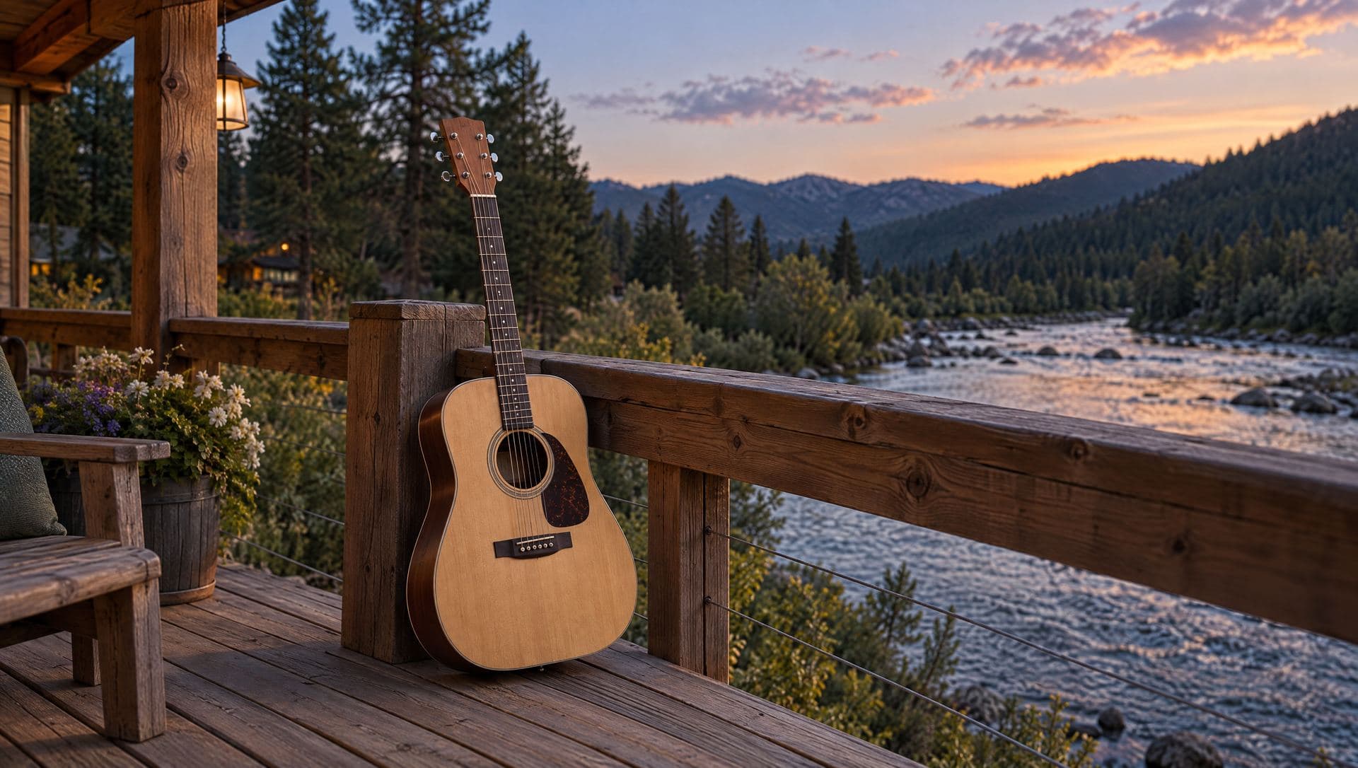
Key takeaways
- Website audio should be optional and user-triggered. Autoplay is always an ambush.
- The silent version of the page must be complete: clear, fast, and useful without sound.
- Accessibility and performance come before atmosphere, every single time.
- Most local businesses should fix offer, mobile speed, proof, and conversion before adding sound.
- The real lesson is distinctiveness with restraint: memorable without making the visitor pay for it.

On this page
Should you add sound to your website?
For most businesses, no, not yet. Website audio is worth it only when it is optional, user-triggered, easy to stop, tied to your brand, and technically light. If your offer, mobile speed, proof, or conversion path are weak, sound is a distraction from the work that actually grows the business.
Adding sound to a website is one of those ideas that can be brilliant or unforgivable, with no polite middle. If it starts by surprise, slows the page, hides the stop control, or exists because someone discovered an audio library after lunch, it should be escorted out of the building.
Done well, it is different. An optional, quiet-by-default soundtrack can make a place-based brand feel rooted and memorable. The deciding question is not whether sound is cool. It is whether the page is already complete and fast without it.
The silent version of the site has to win first. The soundtrack is atmosphere, not infrastructure.
When does website audio help, and when does it hurt?
Audio helps when it is optional, on-brand, and layered on after a fast, clear page. It hurts when it autoplays, hides its controls, slows loading, or competes with the message. The difference is not the sound itself. It is whether the visitor stays in control.
| What is being compared | Audio that hurts | Audio that helps |
|---|---|---|
| How it starts | Autoplays on page load | Starts only after a clear user action |
| Default state | Sound forced on everyone | Silent, fast, and complete by default |
| Controls | Hidden or hard to find | Visible, labelled, keyboard-friendly stop |
| Purpose | Decoration with no meaning | A brand cue tied to a real place or feeling |
| Performance | Heavy files that block the page | Light, loaded behind intent |
| Accessibility | Traps or competes with screen readers | Optional, with no info depending on sound |
| If removed | Page feels broken or empty | Page is still complete and useful |
Why did I add a soundtrack to my own website?
Because Kootenay Made Digital is a place-based brand, not a generic agency skin. The soundtrack is a small, optional proof point: it makes the site feel like it came from here. It is quiet by default and there only for visitors who want the site to feel a little more like the region it comes from.
The Kootenays are not subtle in real life. Mountains sit in the background of ordinary errands. Roads bend around rivers. Smoke season, ski season, lake season, and shoulder season all have their own rhythm. A local website does not need to shout all of that. It just needs to stop pretending the business could be anywhere.
So the soundtrack is one small cue in a larger system: warm copper, forest green, river blue, textured layouts, local references, and copy that sounds like a neighbour rather than a brochure committee. You can see the same restraint in my recent builds, where the useful foundation always comes before the flourish.
I wanted the site to feel like it came from here. A brand rooted in a real place should not feel assembled in a vacuum.
Can website sound hurt accessibility and page speed?
Yes, and this is where most website audio goes wrong. Sound hurts accessibility when it starts unexpectedly, hides controls, or competes with screen readers. It hurts speed when it loads too early or uses heavy files. The fix is to make audio optional, light, and loaded only behind a deliberate click.
Accessibility is not a checkbox you sprinkle on after the confetti cannon goes off. Some people use screen readers. Some browse from quiet workplaces. Some have sensory sensitivity. Some are on mobile data, and some simply hate website audio, a position history has made very easy to defend. The safe baseline below keeps all of them in control.
- Sound starts only after a clear, deliberate user action. Never on page load.
- The default experience is silent, fast, and complete without any audio.
- Controls are visible, labelled, keyboard-friendly, and easy to stop.
- No offer, instruction, or proof depends on a visitor hearing the audio.
- Audio is treated as a progressive enhancement, layered on after the core page is fast.
- Files stay light and do not block the first meaningful page experience.
- The play and stop state is obvious on both mobile and desktop.
- Testing covers screen readers, keyboard flow, reduced-motion users, and quiet workplaces.
Performance follows the same logic. The silent page has to be fast first. Media loads behind intent, the first visit stays quick, and no brand flourish gets to tax the core experience. If you already have a site and are not sure how it performs, the free check-up checks speed, mobile usability, and the basics before you layer anything on top. If you do not have a site yet, that is where a first website starts, foundation before flourish.
What does WCAG 2.2 AA require for website audio?
WCAG 2.2 AA sets a short, clear bar for sound: if audio plays, the visitor must be able to stop it, nothing important can depend on hearing it, the controls must work by keyboard, and any speech needs a caption or transcript. Meet those and you are on solid ground. The easiest way to meet the first one is to never autoplay at all.
Accessibility here is not abstract. It is the difference between a site that quietly excludes people and one that does not. These are the specific points that apply the moment you add sound.
- Audio control (1.4.2)
- If any sound plays for more than three seconds, the visitor needs an obvious way to pause, stop, or mute it independently of their system volume. The simplest way to pass is to never start audio on its own in the first place.
- Captions and transcripts (1.2)
- Ambient, wordless atmosphere carries no information, so it needs no transcript. The moment audio contains speech, though, you owe a caption or a transcript so people who cannot hear it still get everything it says.
- Keyboard and focus (2.1, 2.4.7)
- The play and stop controls must be reachable and operable by keyboard, with a visible focus state, not just clickable by mouse.
- No information by sound alone (1.3.3, 1.1.1)
- Nothing a visitor needs, an offer, a step, a proof point, can depend on hearing the audio. Sound is a layer on top of a page that already says everything in text and structure.
The pattern underneath all four is the same: keep the visitor in control and never make sound load-bearing. An optional, silent-by-default soundtrack with wordless ambience clears this bar comfortably. The trouble only starts when audio is forced, hidden, or carries information the page does not also state in plain text.
When should you avoid website audio completely?
Avoid audio when the core site is not working, when the audience needs calm and control, when the page is used in public or at work, when the visitor is mid-task, when performance is already tight, or when the sound means nothing. If any of these are true, sound makes the page worse, not better.
- 01
The core site is not working yet
If the offer is unclear, the phone number is buried, or the page is slow, audio is just perfume on a wiring fire. Fix the foundation first.
- 02
The audience needs calm and control
Clinics, legal and financial services, counselling, and emergency information should prioritize discretion and clarity over flourish.
- 03
The page is used in public or at work
If visitors check hours from a shop floor or compare options in a quiet office, surprise sound is not charming. It is evidence against you.
- 04
The visitor is mid-task
Checkout, booking, contact forms, quote requests, and job applications need focus. A soundtrack pulls attention away from the click that matters.
- 05
The performance budget is already tight
If images, scripts, fonts, and embeds already drag the page down, adding media before cleanup makes a slow page slower.
- 06
The audio does not mean anything
If the track could sit under any website in any town, skip it. Generic ambience is still generic, just louder.
Which businesses can use website sound well?
Place-based and experience-led businesses fit best: hotels, lodges, galleries, studios, tourism operators, wineries, festivals, and outdoor brands. Task-heavy and discretion-sensitive businesses, like clinics, professional services, checkout, and booking flows, should stay silent. The test is whether sound reinforces a feeling people are already buying.
- Hotels, lodges, and retreats
- Atmosphere is the product. A restrained ambient layer can reinforce the calm or warmth a guest is already booking.
- Galleries, studios, and creatives
- A point of view is expected. Subtle sound can match a distinctive visual identity if it stays optional.
- Tourism and outdoor experiences
- Mood, place, and anticipation are part of the sale. Sound can hint at the feeling people are buying.
- Wineries, festivals, and venues
- Sensory branding fits the category. Audio can extend a real-world experience that is already sensory.
- Clinics and professional services
- Skip it. Discretion, calm, and low friction matter more than atmosphere on these pages.
- Checkout, booking, and forms
- Skip it. A soundtrack competes for attention exactly where a visitor needs none.
If you run a Kootenay hotel, retreat, guide company, gallery, festival, or destination experience, an optional sensory layer might support what people already want: mood, place, anticipation, memory. Even then, the restraint test still applies. The feature should make sense before anyone hears it.
How do you add audio to a website the right way?
Earn the right to add atmosphere by fixing the boring things first. Clarify the offer, make mobile painless, prove the business is real, protect accessibility, and measure the silent page. Only then add audio, and only if it supports the brand and can be removed without breaking anything.
- 01Clarify the offer: what you do, who you help, where you work, and the next step.
- 02Make mobile painless: readable type, clear tap targets, fast loading, visible contact paths.
- 03Prove the business is real: recent work, reviews, photos, service area, and process.
- 04Protect accessibility: headings, labels, contrast, keyboard access, focus, and alt text.
- 05Measure the silent page for speed and usability before adding anything.
- 06Add audio only if it supports the brand, respects control, and can be removed without breaking the page.
This order matters because a unique detail can become a toy, and toys are dangerous when the homepage still fails the basic questions: what do you do, who is it for, where do you work, why should I trust you, and what happens after I click? Audio belongs late in that conversation, after message clarity, mobile usability, accessibility, performance, and the main conversion path are all handled.
How do you add sound without wrecking the page?
Once the foundation earns it, the technical rules are simple and non-negotiable: opt-in only, never autoplay, respect the visitor's reduced-motion setting, remember their mute choice, keep the file light, and load it lazily behind a click. Get those six right and the soundtrack becomes a quiet enhancement instead of a tax on the page.
- 01Make it opt-in only. Sound starts on a deliberate click or tap, never on page load. A clearly labelled play control is the single most important part of the whole feature.
- 02Never autoplay. Modern browsers block audible autoplay anyway, so building around a real user action is both the respectful choice and the one that actually works across devices.
- 03Respect prefers-reduced-motion. If a visitor has asked their system for less motion and stimulation, default even harder to silent and calm, and do not animate the audio control.
- 04Persist the mute state. If someone turns sound off, remember it as they move between pages so they are never re-ambushed. One choice to silence it should hold.
- 05Keep the file light. Compress the track, keep it short and loopable, and budget its weight against the page. A soundtrack that adds hundreds of kilobytes to the first load has already failed.
- 06Lazy-load behind intent. Do not fetch the audio until the visitor asks for it. The core page loads first and fast; the sound file downloads only after the play control is used.
The through-line is that the audio is always a layer added after the fast, silent page, never baked into it. When I added the soundtrack to my own site, the core experience shipped and performed on its own first. The sound file only downloads once a visitor asks for it, the choice to mute it sticks, and a reduced-motion setting quiets the whole thing further. The page never pays for a feature the visitor did not ask for.
A one-afternoon triage before you reach for an audio library
If a brand layer sounds tempting, run this short check first. Name the feeling, audit whether the page already shows it, choose one cue, define the controls, and run the restraint test. Most of the time you will find the missing brand feeling lives in the basics, not in a soundtrack.
- 01
Name the feeling
Write the exact feeling the site should create. Kootenay calm, lodge warmth, studio precision, lake-season ease, or something else specific. Vague moods produce vague decisions.
- 02
Audit the existing page
Check whether that feeling already shows up in the hero, copy, colour, photos, and proof before you reach for a new layer. Usually the feeling is missing from those basics first.
- 03
Choose one cue
Pick a single cue: ambient audio, sharper microcopy, real photography, gentle motion, or a seasonal detail. One sharp cue beats five decorative stunts.
- 04
Define the controls
If the cue is audio, specify off by default, user-triggered play, a persistent stop, a visible state, keyboard access, and clean mobile behaviour.
- 05
Run the restraint test
Ask whether the page is still fast, useful, and quiet by default. If you have to defend the feature for ten minutes, cut it.
The real lesson here is not audio. It is the refusal to be interchangeable. For one business the memorable detail is a calm booking flow. For another it is sharper photography, a clearer promise, a local proof map, or copy that finally sounds like a human who knows the work. If you want help finding yours, talk it through with me. I build websites to be useful first, then give them the details that make a real business feel like itself.
Sources and further reading
- WCAG 2.2: Audio Control
Why audio that starts on its own needs a way to pause, stop, or control volume. The safer rule is to avoid surprise audio entirely.
- MDN: Autoplay guide for media and Web Audio
Browsers restrict audible autoplay on purpose. Treat that as a product clue, not an obstacle: let the visitor choose.
- Google Search Central: page experience
Google frames page experience around whether the page actually helps people. Decorative media cannot rescue a slow or confusing page.
- web.dev: optimize resource loading
Non-critical resources should not block the first useful experience. A soundtrack belongs behind intent and a fast default path.
Frequently asked questions
Should I add background music to my website?
Usually no, not until the basics are strong. Audio earns a place only when it is optional, easy to stop, tied to your brand, technically light, and not covering for weak copy, slow loading, or a confusing offer.
Is website audio bad for SEO and conversions?
Sound alone does not lift conversions, and forced audio that slows the page or annoys visitors can hurt engagement signals. The value of well-handled audio is brand memory, and only once speed, clarity, proof, and a clean next step are already in place.
Should website audio ever autoplay?
No. Audio should never start on its own. Autoplay is one of the fastest ways to lose trust, and modern browsers block audible autoplay anyway. Keep the default silent and let the visitor choose to turn sound on.
Can website audio hurt accessibility?
Yes, if it starts unexpectedly, hides controls, traps keyboard users, or competes with screen readers. The safe baseline is off by default, visible labelled controls, full keyboard access, and no information that depends on hearing sound.
Can a soundtrack slow my website down?
Yes, if it loads too early, uses heavy files, or depends on bloated third-party scripts. Treat audio as a progressive enhancement that loads behind intent, after the core page is already fast on mobile.
What kind of business can use website sound well?
A hotel, retreat, gallery, tourism experience, festival, winery, outdoor brand, or place-based creative studio can use subtle audio well, when the sound reinforces the feeling people are already buying and stays fully optional.
When should website audio be avoided completely?
Avoid it on emergency pages, clinics, professional services where discretion matters, checkout and booking flows, forms, job applications, pages used in quiet workspaces, and any site that is already slow or confusing.
How should website audio controls be designed?
Use plain labels, an obvious play and stop state, keyboard-friendly controls, visible focus, and a persistent way to stop the sound. If people have to hunt for the mute button, the feature has failed.
Kootenay Made Digital
I build websites, local presence, and calm AI setups for Kootenay small businesses. Plain language, published prices, and clear work that makes you easier to find and easier to choose.